Elements
Only <window>, <popup>, <glarea> and <foreign> are backed by real
X11 windows, created top-down in React's commit phase so every
CreateWindow names its actual parent — and, for <foreign>, so that no
ReparentWindow is ever issued from a render React might discard.
Everything else is a retained lightweight node — one
yoga-layout node each — painted into the
owning window's double-buffered 2d context on ntk's frame clock.
style and props
Everything CSS has a concept for goes in style; everything else is a
prop. No name means both, which is why <window width> is unambiguously the
real window's geometry. See styling.md for arrays, state
blocks and createStyles.
<box style={{ flexDirection: 'row', gap: 8 }} onClick={pick}>
  <text style={{ fontSize: 14, color: '#2d3436' }}>hello</text>
</box>
Layout properties (all drawn elements + windows)
Lengths are logical pixels — a number, or the same number written '12px'
— and '50%' / 'auto' pass through to yoga where it takes them. em,
rem, vw/vh/vmin/vmax and calc()/min()/max()/clamp() over
them resolve to pixels for the node they are written on, and again when what
they are relative to moves; a unit CSS has and react-x11 does not read (ex,
cqw, pt) is an error naming it. CSS's shorthands are read too —
padding: '8px 16px', border: '1px solid $border', inset: 0; see
styling.md.
- Size:
width,height,minWidth,minHeight,maxWidth,maxHeight,aspectRatio.<image>and<svg>keep their aspect ratio when only one ofwidth/heightis given - Flex:
flexDirection(row,column,row-reverse,column-reverse),justifyContent(flex-start,center,flex-end,space-between,space-around,space-evenly),alignItems,alignSelf,alignContent,flexWrap,flex,flexGrow,flexShrink,flexBasis,gap,rowGap,columnGap - Position:
position(relative,absolute,static,sticky, or one registered withregisterPosition),top,right,bottom,left,start,end, andinsetfor all four. Understickythe insets are how close to the nearest scroll pane's edges the box may come, not offsets — see styling.md and custom positions - Grid:
display: 'grid'arranges the children as a CSS grid —gridTemplateColumns,gridTemplateRows,gridTemplateAreas,gridAutoColumns,gridAutoRows,gridAutoFlowandjustifyItemson the box,gridColumn,gridRow,gridAreaandjustifySelfon a child — see styling.md - Arrangement:
layout(grid,masonry,equal-row, or one registered withregisterLayout) arranges the children in place of flexbox, and a child'slayoutItemis what it tells that layout — see styling.md - Spacing:
margin,marginTop/Right/Bottom/Left,padding,paddingTop/Right/Bottom/Left, and the logical pairspaddingInline,paddingBlock,marginInline,marginBlock.marginandpaddingtake CSS's one-to-four values as one string:'0 auto','8px 16px' - Visibility:
display(flex,grid,none),overflow(visible,hidden,scroll)
Everything shrinks, nothing shrinks to nothing
flexShrink is 1, as in CSS: an item hands back the space it has spare
when the row it is in runs short, rather than pushing the row past its
container. And it never gives up what is inside it — every item carries a
floor of its own min-content size, which is CSS's automatic minimum size
(min-width: auto on a flex item) written out by the renderer, since yoga
implements the shrinking half and not the floor half. A row of chips squeezes
until it wraps; a label squeezes to its longest word; a height: 40 row
stays 40 tall.
Three ways a style says otherwise:
| write | to mean |
|---|---|
flexShrink: 0 | never give up any space at all |
minWidth: 0 / minHeight: 0 | this may shrink past its content, to zero |
overflow: 'hidden' / 'scroll' | the same, and clip what no longer fits |
The last two are CSS's own rule — min-*: auto computes to 0 on anything
whose overflow is not visible — and they are what makes a scroll pane
possible: a viewport is a box that is allowed to be smaller than what is
inside it. A <box overflow="scroll"> gets minWidth: 0 and minHeight: 0
for free.
One deliberate difference from CSS: a size that was named is kept. CSS
floors an item at min(the size it was given, its content), so an empty
height: 40 box squashes to nothing in a column too short for it; that is
survivable on the web because a <div> is a block container and its
children are not flex items at all, and it is not survivable here, where
every box lays its children out with flex. Say minHeight: 0 to get CSS's
answer for one.
The measurement costs the tree an extra layout pass per axis, on frames that change the layout — a scroll, which moves no box, keeps the single pass it always had.
flex, the shorthand
flex: 1 is { flexGrow: 1, flexShrink: 1, flexBasis: 0 } — "take this
share of what is left, from a base size of nothing" — which is what makes it
the right thing for a pane that should fill its window rather than its
content. flex: 'auto' grows and shrinks from the content's own size, and
flex: 'none' does neither. CSS's long form reads too — '1 1 0',
'0 0 240px', '2 200px'. A longhand written beside it wins, so
{ flex: 1, flexBasis: 'auto' } reads the way it does in CSS.
Paint properties
backgroundColor— any CSS color string ('#2980b9','rgba(0,0,0,.5)','red');backgroundsets it and a gradient (backgroundImage) in one- any colour may be
'currentColor', the node's ink — its owncoloror the one it inherits, followed when it moves (styling.md) borderWidth,borderColor,borderRadius,borderStyle('solid'default,'dashed'), orborder: '1px solid $border'for the first three —border: '1px solid'is drawn incurrentColor- per-side borders:
borderTopWidth/Right/Bottom/LeftoverrideborderWidththe waypaddingLeftoverridespadding, andborderTopColor/… fall back toborderColor;borderBottom: '1px solid $border'sets one side's pair. A blockquote's bar isborderLeftWidth: 3on the quote box, not a 3px sibling; a table rule isborderBottomWidth: 1on the row.borderRadiusrequires uniform borders — a non-uniform border paints square (styling.md) zIndex— paint/hit order among siblings (stable sort)objectFit— where an<image>'s or a<video>'s picture goes in its content box, CSS'sobject-fit, centred:'fill'(<image>'s default),'contain'(<video>'s),'cover','none','scale-down'outlineWidth,outlineColor,outlineOffset— the focus ring, painted outside the border box and invisible to yoga, so it never moves what it surrounds. A focusable node draws one on:focus-visiblewithout being asked;outlineWidth: 0— oroutline: 'none'— opts out (styling.md)opacity— how opaque the node is with everything inside it, from 0 to 1: the subtree is drawn once and composited at that alpha, so a card, its icon and its text fade as one.0draws nothing and is still hit (styling.md)transition—120, or{ backgroundColor: 120, left: 200 }: how long a change to that property takes (styling.md)- any value may be a theme token:
'$panel'resolves against the nearestthemeprop above the node (styling.md) '@width >= 600'blocks restyle for the window's size, layout included (styling.md)opacityis not implemented yet (see NEXT_STEPS.md)
cursor ('pointer', 'text', 'wait', 'move', 'crosshair', resize
arrows, … — the ntk cursor name map) and pointerEvents are style too: CSS
has both, and React Native has been moving pointerEvents the same way.
pointerEvents: 'none' takes a node and its subtree out of hit testing;
'box-none', React Native's, takes out only the node itself — its children
still take the pointer, and a press on its own area goes to what is behind
it. That is the value for an overlay of controls that must not swallow the
clicks between them, a <glarea>'s children over a scene whose input lives
on the element behind the surface included. So is hitSlop:
<box style={{ height: 16, hitSlop: { top: 4, bottom: 4 } }} /> // 24px target
hitSlop: 4 grows every side, the object form only the sides it names. It
is hit testing and nothing else — not paint, not yoga — which is what
lets a 16px control answer over the 24px WCAG 2.2 SC 2.5.8 wants without a
taller control misaligning the row it sits in. The slop may overlap a
sibling's box; hit testing runs front to back over paint order, so the
sibling on top keeps its own pixels either way.
Interaction props
focusable, tabIndex (sequential focus order; -1 is focusable but not
tabbable), autoFocus, trapFocus (own a focus scope — Tab and presses
stay inside it, focus is restored when it unmounts), disabled (never
focusable, and the trigger for a :disabled style block), and the event
handlers listed in events.md.
onLayout is the one handler that reports layout rather than input: after a
layout pass moved or resized the element it gets {x, y, width, height} in
logical pixels — the position within the parent as laid out, so a scroll
does not fire it — once after the first layout and then only when something
changed. It arrives after the pass, so state set from it is safe. It is how
a component reacts to its size when the reaction is not a style
(react-features.md); where it is one,
a '@container' block answers in the same frame
(styling.md).
Every element also takes role and the aria-* props — the web's
accessibility vocabulary, read by the built-in AT-SPI bridge so screen
readers see the tree. They are inert where no assistive technology is
listening, and the defaults already say something sensible for every
element: accessibility.md.
Drag and drop is two more prop families on the same elements —
dropAccept + onDrop to accept a drop, draggable + dragData to start
a drag — and works with other X11 applications as well as inside the app.
Their presence is what registers the node, so there is nothing else to
mount: drag-and-drop.md.
selectable makes an element a selection surface: text inside it can be
dragged over, copied and, on X11, handed to the PRIMARY selection. See
Selecting text below.
scale zooms a subtree, CSS zoom rather than a transform: every length
under the element — and the element's own style — is multiplied by it, and
text is shaped at the size it will be drawn at. It is what an element owning
a viewport (a graph pane, a map) mounts its content inside. Windows take no
scale: scale.md.
<window>
A real toplevel window — an X11 window, or an NSWindow on the Cocoa
backend; the flex, paint and event root for its subtree.
| prop | |
|---|---|
title | window title (UTF-8, via WM_NAME + _NET_WM_NAME) |
width, height, x, y | window geometry (window state, not yoga style — the user may resize). A size is pixels or 'auto', and leaving it out means 'auto' (below). A change sends only what changed: a new size leaves the window where the window manager or the user put it |
backgroundColor | full-window clear color (default white) |
onResize(ev) | ConfigureNotify — the tree reflows automatically. Fires for moves too (see below) |
onExpose(ev) | after a repaint was required |
onCloseRequest(ev) | WM close button — replaces the default answer (see below); WM_DELETE_WINDOW is advertised either way |
states | EWMH _NET_WM_STATE — controlled, see below |
fullscreen, alwaysOnTop | boolean sugar for two of those states |
decorations | false asks the WM for no titlebar or border |
transparent | 32-bit ARGB visual — rounded, translucent windows (below) |
transientFor | ICCCM WM_TRANSIENT_FOR — the window this one belongs to (below) |
onStatesChange(states) | what the window manager actually did |
onClientMessage(ev) | a ClientMessage addressed to this window — EWMH, XEmbed, the tray (below) |
theme | palette that $token style values resolve against, for this subtree |
embeddable | created but never self-mapped: the window waits for an embedder (<foreign> on the other side), which maps it after the reparent. What a <Frame> pane's root window sets |
hidden | realized and laid out, never mapped while true (below) |
frameRate | how the window paces its frames under a stream of changes: 'display' (the default), 'adaptive', 'throughput', a ceiling in fps, or { budget, minFps, maxFps } (below) |
Windows may be nested inside other windows (real X11 child windows).
Ref: the live window object — on X11 the ntk Window, with
getContext('2d'), requestAnimationFrame, setCursor and the whole ntk
API behind it.
On the Cocoa backend
Everything above that is about drawing — geometry, background, resize,
close, transparent, theme, frameRate, hidden — works. What a
window manager does is where the two part company, because macOS has no
separate one to negotiate with, and the honest list is short:
| prop | on Cocoa |
|---|---|
minWidth/minHeight/maxWidth/maxHeight | honoured — they become the window's own min/max size |
resizable, decorations | honoured, but read once, at creation: they are NSWindow style options rather than hints, so changing either after mount does nothing |
transparent, borderRadius | always available; every window composites, so there is no "if a compositor is running" |
states: ['demands_attention'] | the Dock bounce, held until the state is removed |
fullscreen, states: ['maximized' | 'hidden'] | the green button's full-screen Space, the zoom, and the Dock, through toggleFullScreen:, zoom: and miniaturize: |
every other _NET_WM_STATE | inert — sticky, below, skip_taskbar, shaded and the rest have no AppKit equivalent |
onStatesChange, and useWindowState() | fire for full screen (from the transition's begin), the zoom, the Dock and the key window; desktop and obscured never change |
appId, windowType, gravity, the increment and aspect hints | inert. They are messages to a window manager, and there is not one |
transientFor | inert today — a stub waiting on addChildWindow; a managed <Dialog> already floats on its own window |
onClientMessage | never fires — X11's ClientMessage has no counterpart |
embeddable | means a <Frame> pane, and works — but through shared surfaces rather than reparenting (frame.md) |
Inert means inert, not fatal, and today also silent: the prop is accepted and does nothing, so shared application code stays branch-free. See macos.md for why that is the policy and what it costs.
Natural size
A window with no width/height is sized from its content and capped at
the screen. 'auto' says the same thing out loud, and the two axes are
independent:
<window title="prefs" />                               {/* natural, both ways */}
<window width={600} height="auto" />                   {/* height follows the content */}
<window width="auto" maxWidth={720} minHeight={200} /> {/* auto within your own bounds */}
This is CSS's width: auto, read the way CSS reads it for a box whose
containing block is the viewport but which is not in flow — a float, an
abspos, an inline-block: shrink-to-fit. A top-level window has no
container to stretch into, and stretching into the screen is what
fullscreen means.
The size is worked out before CreateWindow, so the window is created
the right size rather than resized into it after mapping. Nothing is ever on
screen at the wrong size, and there is no jump to watch for.
How it is measured, which is worth knowing because the second step is where the surprises are:
- The tree is laid out with no available width, so nothing wraps and the root reports its max-content width.
- That is clamped into
[minWidth, min(maxWidth, the screen)]— the same size-hint props the window manager enforces also bound the auto size, exactly asmin-width/max-widthboundwidth: autoin CSS. Where the two disagree,minWidthwins, which is CSS's order too. - The tree is laid out again at that width, and the height comes from there. A paragraph that had to wrap is taller than step 1 said.
Where this parts company with CSS: shrink-to-fit is
min(max(min-content, available), max-content), and that max(…) means a
CSS box never shrinks below its min-content size even when it overflows. A
window cannot be wider than the screen, so the cap wins and the content is
cut instead.
The cap is the usable area of the monitor the window will open on:
Xinerama's per-monitor rects — so a window on a two-head desktop is bounded
by one screen and not by both — with _NET_WORKAREA taken off it per axis,
so a panel is not space to grow into. Both are read once while createRoot()
connects. On a server with neither, the cap is the screen; with no display to
ask at all — the headless mock — there is no cap. The window manager's frame
is not modelled, so a window that reaches the cap is a titlebar taller than
the work area and the WM will trim it.
Afterwards, auto keeps up with the content until something else sets the
size. Add a row and the window grows, take it away and the window shrinks
back; the moment the user drags an edge, or a window manager answers with a
size of its own, the window is theirs and stops re-fitting. Setting width to
a number is the app doing the same thing, and setting it back to 'auto'
hands it back. Only a size the window did not ask for counts: its own
requests come back from the server as echoes, sometimes late and sometimes
behind a move that still carries the old size, and none of those is anybody
taking the window over.
A re-fit is laid out once, at the new size. On X11 a window takes a size
when the server answers the request, a round trip later, so the frame that
re-fits waits for that answer before it lays out, and the old pixels stay
up meanwhile. Laid out at the size it still had, content that grew would be
drawn for a round trip wrapped and cut off at the bottom of a window too
small for it — a tooltip whose value gained a word. A request answered with
no new size (a window manager refusing it) gives up the wait after 150 ms.
Cocoa takes a size on the call, so there is nothing to wait for there.
REACT_X11_NO_REFIT_HOLD=1 turns the wait off
(debugging.md).
On the Cocoa backend a window is a whole number of points, so content 100.5 points tall makes a window 101 points tall — rounded up, so nothing is cut — and that is still the window's own size rather than one somebody else chose: it goes on following its content.
A floor the content decides
minWidth/minHeight also take 'auto': the smallest size the content
can be drawn at, measured from the tree and handed to the window manager,
which is what stops the user dragging the window below it.
<window minWidth="auto" minHeight="auto">   {/* never smaller than my content */}
<window width={900} minWidth="auto" />      {/* my opening size, the content's floor */}
This is what Qt and GTK both do, and in both it is the default rather than
something you ask for: a Qt layout's minimumSize() becomes the window's
via QLayout::SetDefaultConstraint, and GTK writes the widget tree's
minimum into the WM geometry hints. Here it is opt-in, because a renderer
whose layout is CSS has no floor unless one is asked for — CSS lets content
overflow.
How the floor is measured: the tree is laid out with no room at all, and the floor is how far it still reached. What each node contributes is whatever its own style lets it shrink to, which makes the interesting part what doesn't count:
| the node | contributes |
|---|---|
| a box that named a size | that size |
| a wrapping row | its widest item |
| text | its longest word |
overflow: 'scroll' / 'hidden' | nothing |
a minWidth: 0 of its own | nothing |
a minWidth: 240 of its own | 240 |
A registered element contributes whatever its measureContent answers when
asked for the smallest size it can be drawn at — see
extending.md.
This is the same measurement every node's own floor comes from (above), read
at the top of the tree — so the escape hatch is the same one, and it is the
one CSS, Qt and GTK all spell: min-width: 0, QScrollArea,
min-content-width. A node that named a floor of its own is taken at its
word and its contents stop counting, so a window around a scrolling pane is
floored by everything except that pane.
maxWidth/maxHeight take 'auto' as well, and it means the other half of
the pair: the size the content wanted — the natural size above, not the
floor. 'auto' reads as "ask the content", and the content's answer to how
big is not its answer to how small. On a tree where nothing can shrink
the two are the same number, which is what makes minWidth="auto" maxWidth="auto" the fixed-size dialog — the same thing resizable={false}
says more briefly.
Three things worth knowing:
- A floor is a request. mutter, kwin and xfwm enforce it at the drag; a tiling window manager may size the window however it likes. It stops the user, it does not relieve the app of clipping gracefully — and the renderer will not fight a window manager that ignores it.
minHeight="auto"is measured for the width the window has, and re-sent as that changes. A minimum height is a height for a width — a paragraph is tallest at its narrowest — andWM_NORMAL_HINTSholds two independent numbers with no way to say so. (GTK answers the same question at its minimum width, which is a taller floor than a wide window needs.)- The floor outlives the size. An
'auto'size stops tracking once the user takes the window over; an'auto'bound does not, because stopping them going too far is the whole job. It is measured on every frame that lays out — one extra layout pass per axis asked for — and written only on the frames it actually moves.
Three things worth knowing before reaching for it:
- A scroll container reports its content height, not a viewport height,
so an auto window around a long list opens as tall as the screen. Give the
window a
height, or the scrolling box amaxHeight, if the scrolling is meant to happen inside a smaller window. - The natural size is measured with no available width, where nothing wraps and nothing is short of room to shrink into, so an auto width is the unwrapped row. That makes the width font-dependent: the same window is wider under a wide UI face than under a narrow one.
- Measuring costs an extra layout pass per frame that lays out, for as long as the window is still tracking. A window with both sizes given pays nothing.
hidden — realized, laid out, not on screen
<window hidden={minimized} title="scratch" />
The X window exists at its size — auto sizes included, the content is really
measured — and the tree behind it is live; the window is simply never mapped
while hidden is true. Clearing it maps the window where it stands. Unlike
conditional rendering nothing unmounts in between, so component state,
subscriptions and the X window itself all survive a hide: this is the
declarative form of "minimize by unmapping", and what
Tooltip measures an element label in before
placing it.
A subtree hidden by React — <Activity mode="hidden">, a <Suspense> that
suspended — composes rather than competes: the window is on screen only
while neither says hidden. Hiding releases the keyboard focus of
anything inside (the focus-follows-visibility rule), and the
reveal hands it back unless something else took it meanwhile.
On a <popup> the pair of unmap/map is the whole story. On a managed
<window> an unmap is ICCCM's withdraw — the window manager forgets the
window, and the re-map is a fresh MapRequest, so a WM may frame or place
it anew and states are re-declared rather than remembered.
frameRate — pacing the frames under a flood
<window frameRate="adaptive">…</window>
By default a window paints every frame the clock gives it: on X11 as often
as the server keeps up, on macOS at the display's own rate. That is right
for a UI that answers input — a keystroke, a hover, a scroll — where every
frame is one someone is waiting for. It is wrong for a window whose content
changes faster than anyone can read it: a terminal under cat, a chart fed
by a socket, a simulation ticking as fast as it can. On a 120Hz panel such a
window paints 120 times a second, and where a frame costs a few
milliseconds of the JS thread — full-window CoreGraphics passes on macOS —
most of that thread goes to painting screens nobody sees, and the producer
gets what is left. Measured on a streaming terminal, that was a flood four
times slower on macOS than under XQuartz on the same machine, and the whole
difference was frame count times per-frame cost.
frameRate prices frames in CPU time rather than counting them. A window
under 'adaptive' keeps a budget: painting may take a quarter of the wall
time while the window is busy. Credit accrues at that rate, a frame spends
what it measurably cost — the flush, and on macOS the present — and a claim
that finds the window in debt waits for the credit to reach zero, and no
longer. Four things follow, and they are what the tests pin:
- Idle is immediate. A quiet window has a full bucket, so the first claim after a pause — a keystroke, a click — paints on the next tick, whatever the last frame cost.
- Cheap is unthrottled. A frame that costs less than the credit it accrued leaves the bucket where it was. A blit-scrolled list keeps the display's rate: its frames are memmoves and a strip.
- A rare expensive frame is free. The bucket holds a burst — 50ms of
paint, the floor's interval — so the one relayout in a scroll costs
credit, the credit refills, and nothing waited. Only a stream of
expensive frames drains it, and then each waits
cost × (1/budget − 1): a 6ms frame is followed by 18ms of the thread for everything else. - A flood that ends is un-throttled at once. The debt is never more than one frame's cost, so the prompt that appears when the flood stops waits for that and nothing more.
Two more numbers bound the rule. minFps is the floor: whatever the debt,
the screen is never more than 1000 / minFps ms behind the last paint — a
promise about staleness, not a rate, since a single frame can take longer.
maxFps is a ceiling on top of the display's, cheap frames included — the
knob every terminal already has.
| value | budget | minFps | maxFps | when |
|---|---|---|---|---|
'display' (the default) | 1 | none | none | a UI answering input: every frame the clock gives, after React's own batching |
'adaptive' | 0.25 | 20 | none | a window fed off an input path: a terminal, a live chart, a scene that streams |
'throughput' | 0.1 | 10 | 30 | output matters more than the display: the screen may lag by up to 100ms during a flood |
a number, 60 | 1 | none | 60 | a ceiling and nothing else — the fixed cap |
{ budget, minFps, maxFps } | the three numbers, any subset; the ones left out are 'display''s |
A budget below 1 with no minFps warns in development: after an expensive
frame the next may wait three times its cost with nothing to bound it, and
{ budget, minFps: 20 } is what 'adaptive' does.
Three sources, in order of precedence: REACT_X11_FRAME_RATE in the
environment (adaptive, display, throughput or a number) overrides
everything, the way REACT_X11_BACKEND does, so an A/B run and a field
diagnosis need no code change; then the prop; then
createRoot({ frameRate }), the default for every window of that root;
then 'display'. A <popup> paces itself the same way, from its own prop.
A <glarea> takes the window's policy for its own frames unless
it names one.
What the pacer does not do. It never changes what a frame paints: a held
claim's damage accumulates on the window exactly as it does between two
ticks of the clock, and the frame that follows paints all of it. It never
holds the answer to an input: a click or a key paints the window at once
(the early flush in events.md), held claims included, and the
debt is paid then. And it prices the JS thread's time only — on X11 the
server's work is fenced by the frame clock already, so the pacer rarely
holds a frame there; where a backend has backpressure of its own, the
pacer is inert. REACT_X11_TRACE=requests prints waited= on every frame
the pacer held (debugging.md), and
architecture/frame-pacing.md is the design
record, with the measurements.
onResize fires for moves
onResize is X's ConfigureNotify, which reports any geometry change:
under a window manager that moves windows opaquely, dragging one by its
title bar delivers one per pointer step, all the same size. The renderer
already discriminates — a move costs no layout and no repaint — but a
handler of your own has to, or it does its work per step of a drag. The
event says which it was:
<window
  onResize={(ev) => {
    if (ev.resized) refit(ev.width, ev.height);
    if (ev.moved) rememberPosition(ev.x, ev.y);
  }}
/>
ev.previous carries the geometry these are measured against. Note that
ev.x/ev.y are frame-relative once a reparenting window manager has
framed the window, so they are not screen coordinates — the renderer
resolves the real origin itself for popup anchoring.
Stacking
Nested <window>s stack the way drawn siblings paint: the later sibling
sits on top, and zIndex wins over document order. Reordering them in JSX
restacks the real windows — one ConfigureWindow pass per commit, and
nothing at all when mount order already agrees.
<window>
  <window key="back" /> {/* bottom */}
  <window key="front" /> {/* on top */}
  <window key="always" zIndex={1} /> {/* above both, wherever it sits here */}
</window>
Top-level windows are the window manager's to stack — it redirects the
request — so their order in the tree carries no stacking meaning. Use
alwaysOnTop (below) for those.
Window manager hints
Properties the window manager reads (ntk ≥ 3.5.0). All work at mount and
update; unchanged values are not re-sent. The size hints are flat props like
the geometry they constrain — with style in its own channel the yoga names
are free, so no sizeHints object is needed.
| prop | |
|---|---|
resizable | false pins min and max size to the current size |
| size hints | minWidth, minHeight, maxWidth, maxHeight, widthInc, heightInc, baseWidth, baseHeight, minAspect, maxAspect, gravity |
appId | 'instance', ['instance', 'Class'] or {instance, class} |
windowType | 'dialog', 'utility', 'tooltip'… or an array of fallbacks |
decorations | false asks for no titlebar or border |
<window width={400} height={300} resizable={false} windowType="dialog" />
<window width={400} height={300} minWidth={320} minHeight={200} />
<window width={400} height={300} minWidth="auto" /> {/* measured — see above */}
The four bounds also take 'auto', which asks the content instead of naming
a number: a floor the content decides.
On a <window> these names are the window's, not yoga's: width/height
are the real geometry the user can drag, and minWidth/maxHeight are what
the WM enforces. A window's contents are laid out by its style. The size
hints do double duty on an auto-sized window, where they also bound the
natural size (above) — so resizable={false} pins the window at whatever its
content measured, which is the fixed-size dialog:
<window resizable={false} windowType="dialog" />
transientFor — a window that belongs to another
Without it, every secondary top-level window an app opens is, to the window manager, an unrelated second application: its own taskbar and alt-tab entry, placed wherever new windows go, stacked independently, and it does not minimise with the window it belongs to.
const main = useRef(null);

<window ref={main} title="editor">…</window>
<window transientFor={main} windowType="dialog" title="Preferences">…</window>
Takes a ref to a <window>/<popup>, a ref to any drawn node (resolved
to the window that owns it — so an out-of-flow <box> inside the owner is a
perfectly good handle), a raw XID, 'root' for "transient for this client's
whole window group", or null to clear.
Measured against quartz-wm — the thinnest EWMH implementation in the stack, so this is a floor rather than a best case:
| the client sets | the WM allows | the WM adds to _NET_WM_STATE |
|---|---|---|
| nothing | close, minimize, move, resize, maximize horz/vert, fullscreen | — |
transientFor | close, minimize, move, resize | skip_taskbar, skip_pager |
windowType="dialog" | close, minimize, move, resize | skip_taskbar, skip_pager |
Rows two and three matching is the EWMH rule working as specified: a managed
window with WM_TRANSIENT_FOR and no _NET_WM_WINDOW_TYPE is a dialog.
The converse does not hold — a dialog type with no owner is a dialog
belonging to nobody, with nothing to stack above or iconify with — so set
both, which is what real toolkits do. A fuller window manager also restacks
the transient above its owner and iconifies it alongside; quartz-wm does
neither, and both are policy rather than spec.
It is inert on an override-redirect window, which is every <popup> by
default: the WM never manages those, so nothing reads the property. ICCCM
4.1.2.6 draws exactly that distinction — WM_TRANSIENT_FOR for windows the
WM manages, override-redirect plus a pointer grab for menus. ntk warns if
you ask it to write the property on one.
Resolution happens in the commit phase, not at element creation: a React
ref is not something ntk should be asked to understand. Refs attach in the
layout phase, after every mutation, so on the commit that mounts two sibling
<window>s the second realizes while the first one's ref is still null —
that owner is retried on the frame the mount schedules rather than dropped.
windowIdOf(refOrInstance) is the same resolution, exported: it returns the
XID a ref points at, or null. It is also what an xdg-desktop-portal
parent_window handle needs — `x11:${id.toString(16)}`, lowercase hex
with no 0x prefix. Both shipping portal backends happen to tolerate a
prefix, which is exactly why it is easy to get wrong and never notice; Qt's
parser returns 0 on failure with no error path, so the symptom would be a
silently unparented, non-modal dialog. useWindowId(ref) is the hook form
and returns a getter, like useAnchor.
decorations={false} writes _MOTIF_WM_HINTS — honoured by Mutter, KWin,
Xfwm, Openbox and i3. A window manager that ignores it simply decorates the
window; there is no way to force the matter.
Closing a window
Every window the window manager manages advertises WM_DELETE_WINDOW in
WM_PROTOCOLS, whether or not you pass onCloseRequest. That property is
what lets the WM ask a window to close; a client without it can only be
shot, so the close button becomes XKillClient — the connection dies
mid-frame, effects never clean up, and IceWM asks the user to confirm the
kill first. Advertising it is not an opt-in feature, it is the difference
between closing and crashing, so react-x11 does it for you.
Windows the WM does not frame never advertise it, because nothing would read
it: a child <window> (a region inside another window) and an
override-redirect <popup>. A managed <popup>
is a real dialog and does.
What a close request does is the part you can change:
no onCloseRequest | the primary window unmounts the tree and closes the connection — effects clean up and the process ends on a drained loop. Any other window refuses, and warns in dev. |
onCloseRequest | nothing happens except your handler: setOpen(false) for a dialog, a "save your work?" prompt, root.unmount() for a quit of your own. |
The primary window is inferred, not declared: the first top-level <window>
that is not transientFor another and has no windowType of its own. A
one-window app — nearly every app — is unambiguous, and a lone window is the
app whatever type it declares.
The refusal for secondary windows is deliberate. A {open && <window/>} was
opened by a setOpen(true) somewhere, and closing it behind React's back
would leave a window the app still believes is open and can never reopen. So
a dialog wants a handler:
{
  showSettings && (
    <window
      title="Settings"
      transientFor={main}
      onCloseRequest={() => setShowSettings(false)}
    />
  );
}
Window state
states is EWMH _NET_WM_STATE: modal, sticky, maximized (or
maximized_vert/maximized_horz individually), shaded, skip_taskbar,
skip_pager, hidden, fullscreen, above, below, demands_attention,
focused. fullscreen and alwaysOnTop are boolean sugar for the two
everyone reaches for — fullscreen and above — and they union with
states rather than competing with it. On the cocoa backend
fullscreen is the green button's full-screen Space, maximized the zoom,
hidden the Dock, and demands_attention bounces the Dock icon until the app
is activated, stopping when the state is removed (desktop.md);
the rest have no AppKit equivalent and are inert there.
<window
  states={['skip_taskbar']}
  fullscreen={isFullscreen}
  onStatesChange={(states) => setFullscreen(states.includes('fullscreen'))}
/>
These are controlled props, and the reason is not React convention. On X
the window manager changes state behind the app's back constantly: the user
hits maximize, a global hotkey leaves fullscreen, a tiling WM has its own
opinion. react-x11 therefore diffs states against the previous props,
never against what the window currently has — so a prop is re-sent only when
the app changes its mind, and a WM that disagreed is not fought on the next
commit. onStatesChange is the other half: it reports what the WM actually
did, and subscribing to it is what makes react-x11 watch the property, so a
window without a handler costs nothing.
States are applied before the window is mapped, which is what EWMH 7.7 requires and the only way to open already fullscreen instead of flashing at the normal size first.
alwaysOnTop falls back to Apple-WM window levels on XQuartz, where
quartz-wm does not support _NET_WM_STATE_ABOVE.
onClientMessage — speaking a protocol of your own
Nearly every convention layered over X11 is carried by ClientMessage: EWMH's
requests to the window manager, XEmbed, the system tray, and whatever two
copies of one application agree between themselves. onClientMessage is
every one of them that was addressed to this window.
<window
  onClientMessage={(ev) => {
    if (ev.messageType !== '_NET_SYSTEM_TRAY_OPCODE') return;
    if (ev.data[1] === SYSTEM_TRAY_REQUEST_DOCK) dock(ev.data[2]);
  }}
/>
ev.messageType is the atom's name, which is the point: without it a
handler has to intern its atoms first and compare numbers, and cannot say
anything at all until those round trips have landed. ev.atom is the id it
came in as, ev.format is 8, 16 or 32, and ev.data is the payload at that
width — 5 values at 32, 10 at 16, 20 at 8.
Nothing has to be armed. A ClientMessage reaches its window's owner whatever
event mask that window selected, so a <window> without the prop pays
nothing and one with it needs no other setup.
Three things worth knowing:
- Messages arrive in the order they were sent. The chunked protocols
depend on it —
_NET_SYSTEM_TRAY_BEGIN_MESSAGEand the_NET_SYSTEM_TRAY_MESSAGE_DATApieces after it reassemble by arrival order and nothing else. Naming a type this connection has never seen costs oneGetAtomName, and everything behind it waits rather than overtaking it.messageTypeis thereforenullonly for an atom the server does not know, which is a broken sender. - It is scoped to the window the message names, not to the connection —
that is the whole difference from
useApp().X.on('event'), which sees every event for every window and outlives the element. A message aimed at another window, including the EWMH ones sent to the root, does not arrive here; a window manager wants the raw stream for those (examples/wm-core.js). preventDefault()stops react-x11 acting on the message itself, which today means XDND — for a window answering the drag protocol on its own terms. It does not cover the WM close button;onCloseRequestis that seam.
Sending is useApp().X.SendClientMessage(destination, aboutWindow, atom, format, data, eventMask), or ntk's window.sendClientMessage(name, data)
which interns the atom for you. Note the two window arguments: EWMH messages
about a window are delivered to the root, and messages to another
application's window pass an event mask of 0.
Selections are the other half of most of these protocols, and taking one
needs a timestamp rather than CurrentTime:
lastInputTime and serverTime.
Kiosk
There is no kiosk prop, because it is not one thing — it is a window with
no decoration, no taskbar entry, nothing above it, and no pointer:
<window
  fullscreen
  decorations={false}
  states={['above', 'skip_taskbar', 'skip_pager']}
  style={{ cursor: 'none', flexGrow: 1 }}
/>
cursor: 'none' hides the pointer outright (ntk ≥ 4.2.0). It is not the
same as leaving cursor unset, which inherits whatever the root window's
cursor is — see styling.md.
transparent — rounded corners and translucency
transparent creates the window on a 32-bit ARGB visual, so it has a real
alpha channel: what the tree does not paint stays empty, and a compositor
blends it against whatever is behind. That is what makes rounded corners
possible, and it is the main reason to reach for it:
<popup
  transparent
  grab
  style={{ backgroundColor: 'rgba(24, 24, 30, 0.86)', borderRadius: 14 }}
>
  …
</popup>
Two props do the work together. transparent gives the window somewhere to
put transparency; borderRadius in the window's own style rounds the
background painted into it, and the corners it gives up are the corners the
desktop then shows through. The edge is antialiased, because it is alpha
rather than the Shape extension's 1-bit mask — no XShapeCombineMask, no
jagged diagonal.
backgroundColor may be translucent, and leaving it unset gives a window
that is empty except for what the tree paints.
borderRadius on a window is meaningful only with transparent. On an
opaque window it is ignored: giving up the corners there would only expose
the server's white, which is worse than square.
When transparency is not available
On the Cocoa backend it always is — every window composites and every
window has an alpha channel, so transparent and a borderRadius on a
window simply work, and the rest of this section is about X11.
Transparency there needs two things, and either can be missing: a depth-32 TrueColor visual (XQuartz has none), and a running compositor (Mutter, KWin, picom, …) to blend the alpha channel. Without a compositor the X server shows the raw pixels, and a corner you painted away is not transparent — it is black.
react-x11 never lets that happen. When transparency would not actually be
seen, the window is filled edge to edge and borderRadius on it is ignored:
you get the square opaque popup, not a black-cornered one. A translucent
backgroundColor is flattened rather than composited onto the last frame.
Nothing is required of the application for that floor to hold.
What the application does control is the design on the other side of it,
through the '@supports transparency' style block:
<popup
  transparent
  style={{
    backgroundColor: '#1c1c22', // square and opaque, works everywhere
    '@supports transparency': {
      backgroundColor: 'rgba(24, 24, 30, 0.86)',
      borderRadius: 14,
    },
  }}
/>
See Capability queries. The block is
answered per window and re-resolved live, so a compositor being switched on
mid-session turns the popup rounded without a remount — which is why
transparent still takes the 32-bit visual when nothing is compositing yet.
A visual is a CreateWindow field and cannot be changed afterwards; what
the window paints can.
For decisions that are not styling, useSupports('transparency') answers
the same question about the display, and can be asked before any window
exists:
const canBlend = useSupports('transparency');
const margin = canBlend ? 26 : 0; // room for a client-drawn shadow
To look at the fallback on a display that composites perfectly well,
run with REACT_X11_NO_TRANSPARENCY=1: transparent is ignored, the window
is created on the ordinary visual, and both the style block and
useSupports answer false. Otherwise the only way to see the design you
wrote for XQuartz is to stop the compositor, which takes the rest of your
desktop with it. See debugging.md.
Toggling the transparent prop itself on a mounted window does nothing
until it remounts (change its key) — again because the visual is fixed at
creation. Requires ntk ≥ 6.6.0.
Two things a transparent window does not change. Input still hits the
full rectangle — the corners are invisible, not click-through; use the Shape
extension's input region through the ntk ref if that matters. And child
<window>s are composited by the X server, not the compositor, so nesting a
transparent window inside another window blends against nothing.
<popup>
An override-redirect top-level window at screen coordinates — the
window manager ignores it (no decorations, no focus stealing): menus,
tooltips, dropdowns. May appear anywhere in the JSX tree (its position in
the tree does not affect its position on screen); it is its own paint and
event root. Give it an anchor and it places itself against a node
(below); x/y are there for the
placements that are nobody's node — ev.screenX/screenY, the pointer on
the virtual screen, in the logical pixels x/y are themselves in. Same props as <window> — including
natural size, which is what a menu sized by its own rows
is — and conditional rendering controls its lifetime.
| prop | |
|---|---|
anchor | place against a node, a rect inside one, or a rect on the screen, at whatever size the content turns out to be |
grab | hold a pointer grab while the popup is up — how menus behave on X (below) |
grabKeyboard | take the keyboard while the popup is up — what a popover a tray click opened needs (below) |
transparent | 32-bit ARGB visual: rounded corners and translucency (above) |
onDismiss | a press landed outside the popup: close it |
trapFocus | own a focus scope: a modal (see events.md) |
overrideRedirect | false makes it a WM-managed window instead — a real dialog (below) |
dragPreview | this popup is a drag preview following the pointer, never a drop target — drag-and-drop.md |
anchor — a popup that places itself
function Completions({ editorRef, caret, matches, onPick }) {
  if (!matches.length) return null;
  return (
    <popup
      anchor={{ to: editorRef, at: caret, placement: 'bottom' }}
      maxHeight={220}
    >
      <box
        style={{ overflow: 'scroll', padding: 4, backgroundColor: '$surface' }}
      >
        {matches.map((m) => (
          <box key={m.label} onClick={() => onPick(m)} style={{ padding: 6 }}>
            <text>{m.label}</text>
          </box>
        ))}
      </box>
    </popup>
  );
}
That is the whole completion list: at the caret, as wide as its widest
label, no taller than 220 and scrolling past that, flipped above the line
when it is near the bottom of the screen. Nothing in it measures a font,
states a size, or names a position — caret is a rect the editor already
knows, in its own coordinates.
anchor takes anchorRect's options
— placement, align, offset, alignOffset, alignTo, at — plus to,
the node (or a ref to one) it hangs off. x/y are ignored while it is set.
Why the popup and not the application. A <popup> with no width is
sized from its content like any other window, and that size is settled
inside realize() — after the content is measured, before CreateWindow.
Which side the popup flips to and how far it is pulled back from a screen
edge are both functions of that size, so the earliest anyone can work out the
position is the moment after the measurement — which is already too late for
React to have passed one in. Doing it here keeps the rule the natural size
established: the window is born the right size in the right place, rather
than mapped somewhere provisional and corrected a frame later.
Afterwards it keeps up with everything that can move either half — the anchor's own layout, an ancestor of it scrolling, the owner window being dragged by the window manager, its own content growing a row.
at is a rect inside the node, in the node's own coordinates:
const caret = { x: caretX, y: lineTop, width: 1, height: lineHeight };
Everything reads it — the side that flips, the edge that aligns, the gap
offset leaves — so a popup at a caret behaves like one hung off a small
widget that happens to be there. width/height may be left out, and
{x, y} alone is a point.
A popup whose anchor is a ref that has not attached yet — one written above its own trigger in the JSX — waits for it rather than opening in the corner of the screen. That is one frame, and it is the same rule as the one below: an anchored popup is on screen only while there is something for it to point at.
When the anchor scrolls out of view the popup unmaps and comes back,
where it belongs — and holding its grab again, since X drops a pointer
grab whose window stops being viewable — when the anchor does. A popup is a real X window rather
than an element its ancestors clip, so a caret that has scrolled out of the
editor leaves a list floating over a document it no longer points into —
and there is no position that fixes that. Whether it should close instead
is React state and therefore the application's: do the placement yourself
with useAnchorTracking
and its onOutOfView.
A popup never receives the X input focus, but nodes inside it can hold the
owner window's focus and receive keys — with trapFocus and autoFocus
that is a modal dialog. See
Focus inside a <popup>. A popup that has
no owner window to receive keys for it takes them itself with
grabKeyboard (below).
grab is what makes a menu dismissable. Without it, a press that lands
anywhere else — another application, the root window, or even this app's own
window frame, which belongs to the window manager — never reaches the
client, so the menu stays open behind whatever was clicked. With the grab,
that press is redirected to the popup instead, arrives outside its bounds,
and onDismiss fires. The client's own windows still receive their own
presses (X owner-events), so submenus and the owner window keep working
normally, and only the root popup of a menu needs the grab. Needs
ntk ≥ 3.7.0; on older ntk the popup behaves as it did before.
Select, ContextMenu and MenuBar already do this.
A popover under a tray item
A tray click has no node behind it: useTray's
onClick reports the item's frame on the screen, where the platform knows
it. anchor takes that as rect, in place of to, and places against it
with the same flip, clamp and natural size — kept on the monitor the rect is
on, and below the menu bar, since that is not usable area:
function MenuBarApp() {
  const [open, setOpen] = useState(null);
  const close = () => setOpen(null);
  useTray({ icon: 'waveform', onClick: setOpen });
  if (!open) return null;
  return (
    <popup
      anchor={{ rect: open, placement: 'bottom', align: 'center', offset: 6 }}
      grab
      grabKeyboard
      onDismiss={close}
      onBlur={close}
    >
      <Controls onClose={close} />
    </popup>
  );
}
rect is logical screen pixels, the unit a popup's x/y are in, and
{ x, y } alone is a point, which is all a freedesktop tray reports: its
protocol has no item rect. Nothing moves the rect but a new one, and it is
never out of view.
Centred over something
placement: 'center' puts the popup over its anchor rather than beside
it — the middle of one on the middle of the other, clamped into the monitor,
with nothing to flip to. Over a window's rect it is a dialog, and that is
what Dialog does: it takes its owner window's rect
on the screen when it opens and hands it over as rect, so the popup is
measured, centred at the size it measured and only then created.
<popup
  anchor={{ rect: ownerRect, placement: 'center' }}
  width={360}
  height="auto"
>
A centred popup is centred once. When its own size changes afterwards —
its content growing a line — it keeps its top edge and its horizontal middle
and grows from there, pulled back only as far as it takes to stay on the
monitor: re-centring would move the top edge by half the growth, and with it
whatever the user was reading or about to press. A managed one grows from
wherever the window manager or the user has put it since, and is moved only
to keep it on the monitor. A new rect (or the to node moving) centres it
again.
The monitor comes from the whole rect, not from a corner of it. A menu-bar item's frame starts a few points above the top of the display it is on, so its top-left corner is outside that display — and on a desk where a taller neighbour reaches down past that edge, inside a different one. The monitor the rect overlaps most is the one it is on; a rect that overlaps none takes the nearest.
grabKeyboard is the other half. A menu-bar app has no window of its
own, so the keys a popup's content would normally get through its owner
window arrive nowhere. With it the popup takes the keyboard while it is up:
| backend | what it is |
|---|---|
| X11 | a keyboard grab, taken and dropped with the map, as grab is for the pointer |
| macOS | a window AppKit can make key, at the popup level, shown activating the app — NSPopover's way |
| Wayland | nothing more: a grabbing popup has the keyboard already |
On macOS the window's kind is decided when the popup is created, so the prop
does not change on a mounted popup. There the popover closes on onBlur —
clicking any other app takes the key window away — and on X on onDismiss,
the press outside the pointer grab reports. Written with both, it closes the
same way on either.
Shortcuts in the popover work, with nothing passed. A binding belongs to
the tree's top-level <window>, and in an app that has none it belongs to
the root-level <popup> that took the keyboard — this one, which is where
the keys are arriving anyway:
function Controls({ onClose, onToggle }) {
  useAccelerator([['space']], onToggle);
  useAccelerator([['Escape']], onClose);
  return <box style={{ padding: 12, gap: 8 }}>…</box>;
}
The same goes for everything else that resolves an owner window on its own:
useFileDialog's parent, the global menu, useWindowState. A binding written
where there is neither a window nor a popup under it — above the if (!open)
in the app above, say — hangs off nothing and never fires; development says so
once, and scope anchors one at a node you name.
A managed <popup> is a dialog
overrideRedirect defaults to true and is what makes a menu a menu.
Passing false gives up all of that on purpose and hands the window to the
window manager: it is reparented into a frame, so it has a titlebar, can be
moved, and has a WM close button (onCloseRequest). Together with
transientFor that is a real dialog — above its owner, out of the taskbar
and alt-tab list, minimising with the owner.
<popup overrideRedirect={false} transientFor={anchor} windowType="dialog"
       title="Preferences" trapFocus>
Turn grab off with it. A client-side pointer grab over a window the WM is
trying to let the user drag swallows the press that would start the drag.
That also means a press outside no longer dismisses it — which is correct: a
real dialog does not close because you clicked elsewhere.
The Dialog component does exactly this, and takes
managed={false} to go back to the override-redirect shape.
Defaults to windowType="popup_menu" — the least-wrong answer for a popup
that declares nothing; pass windowType to say what yours is
("tooltip", "dropdown_menu", …). The built-in widgets do:
Select's and DatePicker's sheets are dropdown_menu, Tooltip is
tooltip. The hint is additive — override-
redirect is what keeps the WM from moving or decorating the popup, and
stays on. The EWMH spec asks for the type hint on override-redirect
windows too, so compositing managers can give menus and tooltips
consistent shadows and animations.
<box>
The flex container. All layout + paint + interaction props above.
Ref: the retained node — abs ({x, y, width, height} within the
window, valid after layout).
With overflow: 'scroll' it is also the scroll container — see below.
Scrolling: overflow: 'scroll'
There is no scrolling element. A <box> — or a <window> — whose style
says overflow: 'scroll' becomes a clipped viewport over its own
overflowing children, on both axes:
<box style={{ overflow: 'scroll', flexGrow: 1 }}>{rows}</box>
Wheel events scroll it by default; a scrollbar thumb is drawn on each axis
that overflows, and the thumb can be dragged. overflow: 'hidden' still
means what it always did — clip and do not scroll.
Because the switch is a style and not an element, a pane can start and stop
scrolling without remounting, which is what makes overflow={dense ? 'scroll' : 'visible'} cheap: the node, its children and their state all
survive the change. When a box stops being a scroll container its offset
resets to 0, as it does in CSS.
It is also a tab stop, and answers the keyboard, whenever it has
somewhere to scroll — which is what lets a pane of unfocusable content (a
log, a long <text>, a rendered document) be read without a pointer at all:
| key | |
|---|---|
| arrows | one wheel notch (48px) on that axis |
| PageUp / PageDown | a viewport, keeping a sliver of it |
| Space / Shift+Space | the same, for the hand already there |
| Home / End | the top and the bottom |
One that fits its content is not a tab stop, answers no keys and takes no
wheel: it is a box with a clip, and stopping on it would be a stop that does
nothing. The wheel chains past it to the next scroll container out — the
same thing a browser does — so declaring a pane scrollable never steals a
gesture the window would have answered. The keys are a default action, so an
onKeyDown of your own runs first and preventDefault() cancels them.
A pane that also has an onClick keeps Space for paging: paging is the
pane's own default action and runs ahead of the keyboard activation Space
would otherwise be, so such a pane pages with Space and activates with Enter
(events.md). A focusable row inside
a pane takes both keys and pages with neither — a default action runs on the
focused node, and that is the row.
The bar belongs to the scroller, not to the content painted under it — the
same rule a browser applies — so a press on the thumb never reaches the row
behind it. Dragging keeps the grip where it was taken, so the thumb does not
jump to the pointer, and a press on the track pages towards it, like
PageUp/PageDown. A drag moves the pane by whole device pixels, as a wheel
does (extending.md), so the
scroll stays a blit and nothing in the pane is drawn off the pixel grid.
<textarea> behaves the same way, and there a bar press never moves the
caret.
The layout defaults it brings
overflow: 'scroll' folds three CSS idioms into the resolved style, so a
scroll container does not have to restate them:
| default | when |
|---|---|
flexBasis: 0 | flexGrow > 0 and no width / height |
minWidth: 0 / minHeight: 0 | always |
min-*: 0 is the CSS spec's own rule — min-*: auto computes to 0 on a
flex item whose overflow is not visible — and it is what lets a viewport be
smaller than what is inside it, which is what scrolling is. The zero basis is
half of what flex: 1 means. Without them a header/scroll/footer window
grows past its own bounds as rows are added and the footer is pushed out of
view. Set either yourself to opt out; an explicit value always wins.
Props
| prop | |
|---|---|
onScroll(ev) | {scrollX, scrollY, contentWidth, contentHeight, viewportWidth, viewportHeight} |
onViewport(ev) | {width, height, contentWidth, contentHeight} whenever they change |
scrollbar={false} | hide the drawn scrollbars |
scrollbarColor | thumb color |
Ref: the node, plus scrollTo / scrollBy / scrollIntoView(node) and
scrollX / scrollY / contentWidth / contentHeight. In TypeScript,
useRef<ScrollableNode>(null) types those in; DrawnNode still works for a
box you do not scroll.
scrollTo(y) takes a number for the vertical axis; scrollTo({x, y}) moves
either, leaving alone whichever you omit. scrollBy matches.
scrollIntoView(node) scrolls the minimum amount on both axes, and a node
larger than the viewport that already covers it not at all.
canScroll(dx, dy) answers whether there is room to move on the axis a delta
names — what the wheel asks each node on its way out, and the one method an
element of your own implements to be asked it too
(extending.md).
Horizontal content comes from children that will not shrink — a row of
fixed-width cells, say. The extent is measured through the subtree, the
way scrollWidth is in a browser: a row that stretches to the viewport
while its own cells overflow it still reports something to scroll. Anything
that clips its own children ends that measurement, since their overflow
belongs to them.
A device with a horizontal axis scrolls sideways with it; Shift + vertical wheel does too, for the mice and touchpads that have none. When both bars show, each stops short of the other's corner.
The distance is the device's, not a constant: where the server has XI2 a touchpad's scroll arrives as the fraction of a notch it measured, so a pane moves by a few pixels rather than by 48 at a time. A wheel notch is still 48 pixels, and so is an arrow key (events.md).
onViewport fires from layout, not from scrolling, so it arrives for a
list nobody has scrolled yet. That is what a virtualized list needs before
it can decide how many rows are worth building: layout runs on the frame
clock, after the commit that mounted the node, so an effect cannot read the
size off the ref. Table is built on it. onLayout
(Interaction props) is the same signal on any element;
onViewport adds the content size a scroller measures.
scrollIntoView(node) scrolls the minimum amount that makes a descendant
node fully visible — for one larger than the viewport, CSSOM View's
block: nearest: left where it covers the viewport, and otherwise brought
in by the edge that moves it least — and is safe to call from an effect right after that
node mounts: the request is resolved on the next layout pass, when the
node actually has geometry. Asking repaints nothing by itself. A request
that finds the node in view already leaves the pane as it was, so focus
moving between the fields of a form in a pane costs what it costs outside
one: the two focus rings. One that does move the pane is a scroll like any
other: where the backend can copy pixels, what stays on screen is copied
and only the strip the move uncovers is repainted.
scrollTo answers inside the call, from the extent the last layout pass
measured: the offset moves and onScroll fires before it returns. When a
pass is already owed, the part of the request that extent could not answer
is kept as well, and the pass answers it again against the content it
measures, before the frame paints. Two cases need that:
- A pane no pass has laid out yet has no extent at all. Restoring a list's
position from a mount-time
useLayoutEffectshows the list at that position in its first frame. - Rows added in the commit the request comes from are not in the extent
yet. A log that follows its new lines with
scrollTo(Infinity)from a layout effect shows each one at the end, in the first frame that has it.
Infinity means the end, wherever the pass finds it, and the End key goes
there the same way. Prefer it to contentHeight, which is the last pass's
measurement too: a target computed from it falls short when a commit adds
more than a viewport. A scrollBy made before that pass moves on from where
the pass puts the pane. Until the pass, scrollX/scrollY read the call's
answer, and onScroll reports the pass's once it is over.
onScroll fires for every move of the offsets, not only the ones a call
made. The wheel, the keys, a bar and scrollTo/scrollBy on a laid-out
pane report inside the call. Layout moves the offsets on its own, and a
browser fires scroll for each: the held scrollTo above landing, a
scrollIntoView resolving (focus landing on a row below the fold is one),
and the clamp that pulls the offset back when the content shrinks or the
viewport grows under it, as when rows are filtered out of a list scrolled
to its end. Those report once the pass is over, like onViewport: after
the frame that shows the new offset, and only if the pass moved it. The
payload is read when the report is delivered, so a handler that mirrors the
offset into state, as Table does, ends where the pane did.
On a <window>
<window style={{ overflow: 'scroll' }}> scrolls the window's own content,
with no inner pane at all — the same wheel, keys and bars. The window stays
a frame to a screen reader whatever its overflow says. Its ref is still
ntk's Window, so reach the scroll API through a ref on a box inside it, or
through the node in onViewport.
<text>
Shaped, wrapped text through ntk's text stack (bidi, ligatures, kerning,
font fallback). Strings/numbers are only legal inside <text>; nested
<text> elements are style spans — the paragraph is laid out as one
run list so wrapping spans the whole content.
| prop | |
|---|---|
color | text color — inherited (see below) |
fontSize, fontFamily, fontWeight, fontStyle | ntk font style (fontconfig lookup + fallback) |
fontVariationSettings | a variable font's axes — see below |
textRendering | which glyph path to draw with — see below |
letterSpacing | space after every character, in px — see below |
fontVariantNumeric, fontFeatureSettings | figures and OpenType features — see below |
textAlign | left, right, center, start, end (bidi-aware) |
lineHeight | multiplier over the natural font line height |
textWrap | wrap (default) or nowrap |
maxLines | how many lines are kept — unlimited by default |
textOverflow | clip (default) or ellipsis, for what was cut |
The first four rows, fontVariationSettings, textRendering,
letterSpacing and the two feature properties inherit — from a nested
span's point of view that has always been true, and it is equally true
across a <box>, so a caption block is written once around the labels in it
(styling.md).
The rest do not: they shape the box the lines flow in, which belongs to the
<text> that owns it.
maxLines and textOverflow are how a label says it did not fit —
{ textWrap: 'nowrap', textOverflow: 'ellipsis' } is one line ending in a
… at the pixel the box ends at, and an ellipsis with no maxLines means
one line. The cut is a fact about the pixels only: the accessible name, the
caret indices and textContent() are all still the whole string. See
styling.md.
A face the app supplies itself — one it ships, or one the user picked in a
dialog — is opened with loadFont/useFont, which hand back the family
name to put in fontFamily
(styling.md).
start and end are resolved against the box's own direction, not
against the first strong character in the string — the box says which way it
reads and the paragraph is laid out at that base level, so "(12) files" in
an RTL panel punctuates as an RTL sentence and a <text> with no strong
characters at all still lands on the right side.
See styling.md.
Variable fonts
ntk ≥ 7.1.0.
A variable font is one file with a continuous design space, and
fontWeight already drives its wght axis — so a family with one variable
file behaves like a family with nine faces, and like nine hundred, since
the weights between the named instances are the point of an axis:
<text style={{ fontFamily: 'Inter', fontWeight: 460 }}>
  Serious by default.
</text>
fontVariationSettings is for the other axes, by OpenType tag:
<text style={{ fontVariationSettings: { wdth: 87.5, slnt: -8 } }}>
  condensed
</text>
It inherits into spans like any other text style prop, and a span may override it. Axes the font does not have are ignored and values are clamped to each axis's range, so it is safe to set without checking the face first. It is compared by value, so the object literal above is fine — a fresh one with the same numbers on the next render costs nothing.
ntk instantiates on demand and rasterizes only the glyphs actually drawn,
at the size drawn; both its caches are bounded. What it does not do is
quantize for you, so a slider bound straight to an axis with step={1}
really will ask for hundreds of distinct faces as it is dragged — step the
control, not the font. See ntk's docs/fonts.md for the whole picture,
including why a variable .woff2 cannot be instantiated and you want the
.ttf.
textRendering
ntk ≥ 7.2.0. CSS's property, picking which glyph path draws the text.
| value | |
|---|---|
auto (default) | ntk decides from the size — right for UI text |
geometricPrecision | glyph origins exactly where shaping asked; nothing cached |
optimizeSpeed | ntk's cached glyph bitmaps, at any size |
optimizeLegibility | accepted, means auto — there is no hinting to turn on |
<text style={{ fontSize: 96, textRendering: 'geometricPrecision' }}>
  Serious by default.
</text>
Why display text wants it. On the cached path a glyph's advance is baked
into the server-side glyphset as a whole number, because a cached bitmap can
only land on a whole pixel. Animate a variable font's wght and the true
advances move by hundredths of a pixel — hundredths that accumulate along
the line until one glyph crosses a rounding boundary and jumps a whole pixel
on its own while its neighbours stand still. geometricPrecision puts every
glyph where shaping asked, so the line slides instead of stepping.
It inherits into spans and a span may override it, so a headline and the body text under it can take different paths in one paragraph.
It never reflows. Only draw-time rounding differs; ntk's layout measures byte-identically for every value, down to per-run offsets. Changing it drops the cached layout — the value rides on the spans inside it — and repaints, without marking anything dirty for yoga. So it is safe to flip on a state change without the tree moving.
The cost is real: the precise path rasterizes outlines on every draw and
caches nothing. That is the right trade for text being animated and the
wrong one for a paragraph that never changes, which is why auto is the
default rather than the other way round.
Letter spacing and figures
ntk ≥ 8.9.0 on X11, @windowkit/appkit ≥ 0.11.0 on Cocoa.
fontVariantNumeric: 'tabular-nums' gives every digit one width. Most UI
faces — SF Pro, Inter — draw proportional figures by default, where a 1 is
much narrower than an 8, so a number that changes while you watch it
changes width too, and a readout beside a slider shuffles its row on every
value. Tabular figures hold it still:
<text style={{ fontSize: 30, fontVariantNumeric: 'tabular-nums' }}>
  {hz} Hz
</text>
The keywords are CSS's: lining-nums or oldstyle-nums, proportional-nums
or tabular-nums, diagonal-fractions or stacked-fractions, ordinal and
slashed-zero — several at once, at most one from each pair, as in
'tabular-nums slashed-zero'. 'normal' puts the face's own figures back.
fontFeatureSettings is any OpenType feature, by its four-letter tag: an
array of the ones to turn on, or an object of tag to on, off, or the
alternate a feature picks.
<text style={{ fontFeatureSettings: ['tnum', 'zero'] }}>0.10</text>
<text style={{ fontFeatureSettings: { ss01: true, salt: 2 } }}>Rag</text>
Where the two name the same feature, fontFeatureSettings wins. A feature
the face does not have is ignored, and the settings are compared by value,
so an object literal is fine.
letterSpacing is CSS's letter-spacing, in logical pixels: added after
every character, the last on a line included, and negative to tighten.
<text style={{ fontSize: 11, fontWeight: 600, letterSpacing: 1.26 }}>
  NOISE TYPE
</text>
Spaced text drops the optional ligatures — liga, clig, dlig and
hlig — because a ligature is one glyph, with no gap in its middle to open.
Name one in fontFeatureSettings to keep it anyway.
All three inherit, and the two feature properties inherit apart, as CSS
inherits them: a fontVariantNumeric below replaces the one above and
leaves an inherited fontFeatureSettings alone. All three can move glyphs,
so a change re-measures, and none of them may go in a state block.
Tiny text
Text smaller than 6 logical pixels is painted as a strip of its ink over the band its letters sit in, one rectangle per line, instead of as glyphs. A zoomed-out view — a minimap, a graph at a tenth of its size, a grid of five thousand cells — is a screen of labels nobody can read, each of which would cost a glyph run at the price of a legible one; below a legible size a label is a smudge of its ink, and the strip is that smudge for one fill. Layout is untouched: the text is still shaped, the strip is as wide as the line. The size is logical because legibility is physical — a 5px label is the same size on a 2x panel as on a 1x monitor.
createRoot({ textStripBelow }) moves the line, in logical pixels; 0
keeps glyphs at every size. REACT_X11_TEXT_STRIP_BELOW is the same line
for a process that cannot reach createRoot.
Selecting text
Issue #259. A label is not selectable, the way Gtk.Label is not: a
desktop application is full of text that is chrome rather than content, and
a stray drag lighting up a button's caption is noise. Text becomes
selectable when an element says so.
<box selectable style={{ padding: 12 }}>
  <text style={{ fontSize: 20, fontWeight: 'bold' }}>Release notes</text>
  <text>Everything below this heading can be dragged over and copied.</text>
</box>
That one prop is the whole feature. The element becomes a surface: a drag inside it selects across every piece of text under it, a double click takes a word, a triple click takes a block, Ctrl+A takes the surface and Ctrl+C copies it. Releasing the button hands the text to PRIMARY, so a middle click in a terminal pastes it — which is what selecting text means on X11 (clipboard.md). macOS has no PRIMARY, so there a release copies nothing and only a copy reaches the pasteboard (clipboard.md).
What is in a surface
Everything under it that can answer for its own text, in document order.
<text> can; so can any element that implements the accessors in
extending.md — a terminal, a log
view, a code editor written outside this package are all selected across by
the same drag, with no registration call.
What is not in it:
- anything under a
selectable={false}, which is CSS'suser-select: none. A list's bullets, a table's chrome, a button's caption inside a document; <textinput>and<textarea>, and any element that sayshasOwnSelection— they keep their own selection, and a press in one is theirs;<svg>, and any registered element that draws its own text, which draw their text through an ntk widget that exposes no character geometry to us.
What a copy assembles
The separators come from the layout, not from the markup: core cannot
know that one <text> is a table cell and another is a paragraph, and
asking every application to say so would be a second authoring model for
something the screen already shows. Two pieces of text sharing a band of
pixels are joined with a tab; one that starts below the last is joined
with a newline. For a table laid out as rows of cells that is exactly
"cells with tabs, rows with newlines", and for ordinary prose it is one
paragraph per line.
// copies as "name\tsize\nnotes\t4 kB"
<box selectable>
  <box style={{ flexDirection: 'row' }}>
    <text style={{ width: 120 }}>name</text>
    <text>size</text>
  </box>
  <box style={{ flexDirection: 'row' }}>
    <text style={{ width: 120 }}>notes</text>
    <text>4 kB</text>
  </box>
</box>
A list marker excluded with selectable={false} is absent from the copied
text as well as from the highlight, which is the point of excluding it.
The props
| prop | |
|---|---|
selectable | true starts a surface; false opts a subtree out of the one above it |
selectionColor | the highlight behind selected text (default: the theme's selection, a tint of its accent) |
onSelectionChange(ev) | ev.text is what a copy would put on the clipboard, ev.isCollapsed whether it is empty |
And on the surface's node, through a ref: selectAll(), clearSelection(),
selectedText(), setSelection(anchor, focus) — each end
{ node, index }, indices in code points — and textSelection, a snapshot of
{ isCollapsed, text, ranges }.
One selection, and where the keys go
Only one selection is visible in an application at a time. Selecting in a document collapses the highlight in the field beside it, and selecting in a field clears the document — the two never both claim to be showing the selection, which is a rule core holds rather than one every surface has to keep. That is also what makes PRIMARY honest: there is one selection on the display, so there is one here.
A surface is a focus target, because Ctrl+A and Ctrl+C are keystrokes
and a keystroke has to arrive somewhere. That puts it in the Tab cycle;
tabIndex={-1} takes it back out while leaving it focusable by a press —
which is the right choice for a document inside a larger UI, and the wrong
one for a reader whose window is the document.
The pointer shows an I-beam over a surface, the way it does over a field.
style={{ cursor: … }} overrides it as usual.
The selection is reported to assistive technology as it moves: a <text>
already exposed AT-SPI's text interface, and the range a reader has dragged
across now travels through it (accessibility.md).
The geometry underneath
The selection is built out of four accessors that every drawn node answers,
and they are public in their own right — a caret rect is what an
autocomplete popup anchors to (<popup anchor={{ to, at }}>), and a hit
test is how an app turns a click into a character offset:
const node = paragraphRef.current;
node.textContent(); // 'Everything below this heading…'
node.textIndexAt(ev.x, ev.y); // 14 — window coordinates in, a code point out
node.textCaretRect(14); // { x, y, width: 0, height }
node.textRangeRects(4, 14); // the bands a highlight over [4, 14) fills
Indices are code points, not UTF-16 units, so an emoji is one position.
Rectangles are in the owning window's coordinates — the same space as
abs and contentBox(), which is device pixels; a mouse event's x/y
are logical (scale.md). textRangeRects returns
one band per line and one per direction run inside a line: a range that
crosses from Latin into Arabic covers two separate stretches of pixels, and
a single rectangle drawn between two caret positions would paint over text
nobody selected.
<textinput>
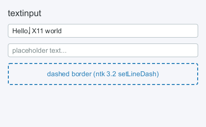
Single-line editable text. Caret and selection geometry come from ntk's
TextLayout.caretPosition/indexAt (ntk ≥ 3.3.0), so positions are exact
across kerning, shaping boundaries and trailing whitespace.
| prop | |
|---|---|
value + onChange(ev) | controlled mode (display follows the prop) |
defaultValue | uncontrolled mode |
onSubmit(ev) | Enter or Shift+Enter; with Ctrl, Alt or Super held it is a shortcut's (events.md) |
name | field name, echoed on the event |
placeholder, placeholderColor | shown when empty |
maxLength | code-point limit |
selectionColor, caretColor | selection/caret paint |
inputMode | what an input method should expect — the DOM's numeric, decimal, tel, email, url (events.md) |
| text style props | as <text> |
The text style props include textAlign, and the field is laid out at its
box's direction the way a <text> is: the value, the placeholder and the
caret sit at the base direction's start edge — the right-hand one under
direction: 'rtl' — and the value is shaped at that base level rather than
at its own first strong character, which is what makes "(1) 12:30 — نص"
punctuate the same way in a field and in the paragraph beside it. Clicking,
the caret, the selection bands and the horizontal scroll are read from one
placement, so they mirror together. See
styling.md.
The change event
onChange and onSubmit get a synthetic event, the same shape every other
handler in the library gets, rather than a bare string:
<textinput
  name="email"
  value={email}
  onChange={(ev) => setEmail(ev.target.value)}
/>
| on the event | |
|---|---|
ev.value, ev.target.value | the text after the edit |
ev.name, ev.target.name | the name prop |
ev.type | 'change' or 'submit' |
ev.target, ev.currentTarget | the node (they are the same — this does not bubble) |
ev.nativeEvent | the X key event, or null — see below |
preventDefault, stopPropagation | present for uniformity; nothing reads them |
Two details worth knowing:
ev.target.valueis the new value even in controlled mode, whereprops.valueis still the old string until the parent re-renders. That is what makese.target.valuemean here what it means in the DOM, and it is why react-hook-form and formik work — see docs/ecosystem/forms.md. It is true while the handler runs:ev.targetis the live node, so a handler that stashes the event and readsev.target.valuelater sees whatever the control holds then.ev.valueis a snapshot and always safe.ev.nativeEventcan be null. A keystroke carries the X key event that produced it, but an edit can also come from a paste resolving, an undo, or a value the parent pushed back — none of which has an X event behind it. Guard it. (Not academic: downshift readsevent.nativeEvent.preventDownshiftDefaultunguarded, so a null there is a TypeError rather than a no-op.)
The node behind ev.target is writable, too. node.value = '' sets the text
without firing onChange, the way assigning to a DOM input's value does —
that is how react-hook-form's register() resets a field through its ref.
Interactions: click/drag selection, double-click word select, triple-click
select all, dead keys and Compose
(events.md), Backspace/Delete, arrows (+Shift extends), Ctrl+arrows
and Ctrl+Backspace/Delete by word, Home/End, Ctrl+A,
Ctrl+C/X/V on CLIPBOARD, middle-click paste from PRIMARY, selections own
PRIMARY (X11 conventions, select-all included; X11 only), Ctrl+Z / Ctrl+Shift+Z (Ctrl+Y too) to undo
and redo, and a right-click menu. On the Cocoa backend the keys are the
Mac's instead: the chords are ⌘ — ⌘A, ⌘C/X/V, ⌘Z / ⇧⌘Z — ⌥ moves and deletes
by word, ⌘←/→ and ⌘↑/↓ go to the ends of the line and of the value, ⌘⌫
deletes to the start of the line, ⌃A, ⌃E, ⌃K, ⌃Y and the rest of AppKit's
Emacs keys work while any other ⌃ chord types nothing, and ⌥ types what the
layout puts on a key, ß for ⌥S (events.md).
Focusable by default; shows the text cursor. ev.preventDefault() in your
onKeyDown/onMouseDown suppresses the built-in editing behavior. To copy
or paste from anywhere else — a canvas, a list, your own menu item — see
clipboard.md.
The right-click menu
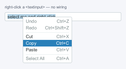
Right-clicking gives Undo / Redo / Cut / Copy / Paste / Select All with no
wiring, the way a browser gives <input> one — each row live only when it
would do something, and every row running the same code the keyboard
shortcut does. Right-clicking inside a selection keeps it (the menu is
about to act on it); outside one, the caret moves there first.
Paste is greyed when nothing owns the CLIPBOARD selection. The field subscribes to selection changes the first time its menu opens rather than asking on the way in — asking would mean a round trip against whatever foreign client owns the clipboard, and a wait if that client is wedged, at exactly the moment a menu should already be on screen. So the very first menu of a session still shows Paste enabled; every one after it knows. On a server without XFixes it stays enabled, which is where it started. On macOS it follows the pasteboard's change count, a quarter second behind a copy made in another app (clipboard.md).
Arrows walk the rows, skipping the disabled ones, Enter chooses, Escape or a press anywhere outside closes. The selection stays visibly highlighted while the menu is up, even though the popup holds the keyboard.
To replace it with your own, set contextMenu={false} and render a
ContextMenu — onContextMenu still fires. To suppress it for one event,
call ev.preventDefault() in an onContextMenu handler.
The menu is not the field's private property: openEditMenu(node, at, actions) opens this one for anything that edits or selects text — a code
editor, a rendered document with a selection — and <textinput>'s own menu
is a caller of it, which is what keeps the two the same menu. See
extending.md.
sensitive
<textinput sensitive> is a field whose text never reaches a selection.
Ctrl+C and the copy half of Ctrl+X do nothing, the menu offers neither Cut
nor Copy — absent rows rather than greyed ones, because a greyed Copy over a
password reads as a bug in the application — and selecting text does not take
PRIMARY, so a middle click in another window cannot spend it. Everything else
is untouched: the caret, the selection itself, the arrows, undo, and pasting
in.
The line it draws is between what is on screen and what is on the clipboard.
The first stops being visible when the field is hidden or the window closes;
the second is readable by every client on the display until something else
takes the selection, and a clipboard manager will have written it down.
PasswordInput sets it on the input it shows while the secret is revealed —
see components.md. An input method is on the
same side of the line: on Wayland a sensitive field is declared
sensitive_data and none of its text is offered as surrounding text
(events.md).
Ref: the node, plus value, undo() / redo() and canUndo /
canRedo — enough for a toolbar button beside the field.
Undo
Consecutive typing coalesces into one undo step, so Ctrl+Z takes back a
word rather than a keystroke; a run of Backspaces coalesces the same way.
A run ends at whitespace, at anything that moves the caret (arrows,
Home/End, a click, focus leaving the field), and around edits that are
their own step whatever surrounds them: a paste, a cut, a replaced
selection, Ctrl+Backspace (⌥⌫ and ⌘⌫ on a Mac, and a ⌃K), and a <textarea>
newline. Undo restores the
selection and puts the caret back where the undone edit started.
A composed character is one entry, not one per keystroke: the accent a dead
key is holding is not in the value until it commits, so Ctrl+Z after
dead_acute e steps over é rather than into it.
Undo is a stack of snapshots of the states the control has shown, capped
at 200. A controlled value reports the restored text through
onChange and waits for the prop to come back, exactly as typing does —
so a parent that filters or rejects a value gets the same say over an undo
that it has over an edit. A value changed from outside (a form reset)
becomes its own entry, and undoing steps back through it.
<textarea>
Multi-line editable text on the same editing core as <textinput>:
word-wraps at the content width, Enter and Shift+Enter insert a newline
(Ctrl+Enter fires onSubmit, ⌘↩ on the Cocoa backend, and with no onSubmit
is left to a shortcut, as Alt+Enter and Super+Enter are everywhere but there —
events.md), Up/Down move between visual lines keeping a goal column,
Home/End go to the start/end of the visual (wrapped) line, selection spans
lines, and the view scrolls vertically to follow the caret (mouse wheel
scrolls too). On the Cocoa backend ⌘←/→ are Home/End, ⌘↑/↓ go to the ends of
the value and ⌥↑/↓ to the ends of a paragraph
(events.md).
The wheel reaches it through the same chain a <box overflow="scroll"> is
in, so a field whose text fits passes the gesture out to the pane or the
window behind it rather than swallowing it.
| prop | |
|---|---|
rows | preferred height in text lines (default 3) |
| everything else | as <textinput> (onSubmit fires on Ctrl+Enter, ⌘↩ on Cocoa) |
<image>
| prop | |
|---|---|
src | client-side pixels, in any of the four forms below, or a symbol by name |
picture | { id, width, height } — an existing server-side Picture, composited as-is |
drawable | { id, width, height, depth? } — an existing Pixmap/Window, composited as-is |
cacheKey | the source's identity, when src is re-derived per render |
alt | the accessible name — what a screen reader says (accessibility.md) |
One source per element — src, picture and drawable are mutually
exclusive, and passing two throws.
Sized by style — style={{ width, height }}, never flat props, since both
are style names. With only one of the two set the other follows the natural
aspect ratio; with neither, the image measures at its natural size, shrunk
to the width on offer. For the server-side sources the "natural size" is the
width/height stated in the descriptor.
<image src={photo} style={{ height: 64 }} /> // width follows the aspect ratio
objectFit decides where the picture goes inside that box when the two
shapes differ: 'fill' — the default — stretches it to the box, 'contain'
fits it inside with the background around it, 'cover' fills the box and
cuts what overflows, 'none' leaves it its own size and 'scale-down' is
the smaller of 'none' and 'contain', all centred.
<image src={photo} style={{ width: 96, height: 96, objectFit: 'cover' }} />
src — pixels the client has
<image src="./logo.png" />                     // file path or file URL
<image src={bytes} />                          // encoded PNG, JPEG, WebP, …
<image src={{ width, height, data }} />        // raw straight RGBA
<image src={ntkImage} />                       // an ntk Image (or Surface)
A file path (or new URL('./logo.png', import.meta.url)) is read and
decoded asynchronously; the element measures 0×0 until the decode lands,
then reflows. Style it a width and height and nothing moves when it
does. The in-memory forms skip the filesystem — pixels that arrived from a
socket, a decoder, or a getImageData readback go straight on screen — and
raw RGBA and an ntk Image are synchronous. Encoded bytes are synchronous
where the decoder is (PNG and JPEG under Node) and land a moment later, the
way a file does, where it is not: any format under Bun, and WebP elsewhere.
Raw data is width × height × 4 bytes of straight (non-premultiplied)
RGBA — exactly what getImageData hands back — and the object is treated as
immutable content: hand over a new object when the pixels change, or the
renderer cannot tell. That goes for encoded bytes too, which under Bun are
read on another thread after the commit.
Formats, and what decodes them
The format comes from the bytes, never from a file name. Which decoder reads them depends on the runtime:
| format | under Bun | under Node |
|---|---|---|
| PNG, JPEG | Bun.Image, off the JavaScript thread | pngjs, jpeg-js — synchronous |
| WebP | Bun.Image, off the JavaScript thread | image-in-browser, loaded on the first WebP |
| GIF, BMP | Bun.Image, off the JavaScript thread | not decoded — the error says to convert |
| TIFF, HEIC, AVIF | Bun.Image through ImageIO (macOS), WIC (Windows) | not decoded; nor under Bun on Linux |
Under Bun, Bun decodes everything, PNG and JPEG included, which the JavaScript decoders could read: libjpeg-turbo, spng and libwebp are built into the runtime and run on a worker thread. A 1080p JPEG takes ~110ms of the JavaScript thread inside jpeg-js and ~7ms under Bun, which is the difference between a stall the user feels and none. What it costs is that bytes under Bun land a frame or so late, like a file. Where that matters — a test that measures the element on its first frame — decode the bytes yourself and pass the result, which is used as-is on every runtime:
import { decodeImage } from 'ntk/image'; // PNG and JPEG, synchronous

const logo = <image src={decodeImage(bytes)} />;
The WebP decoder under Node is pure JavaScript, imported the first time a WebP arrives so an app that shows none never loads it: the first WebP pays ~140ms to load the decoder, and each one about what jpeg-js costs a JPEG of the same size.
An element that draws images of its own — a document's <img>, a CSS
background — decodes through the same ladder, so that an image shows there
exactly when it would show in an <image>: decodeImageBytes from
react-x11/ntk takes the bytes and answers an Image, or a promise of one
wherever the table above says the decode is not synchronous, and throws or
rejects, saying what to convert to, where an <image> would show nothing.
What differs between the two, so it is not found the hard way:
- An animation shows its first frame — an animated WebP on either runtime, a GIF under Bun. Bun's libwebp cannot decode an animated WebP at all (Bun 1.4), so under Bun that one goes to the JavaScript decoder too.
- A JPEG's EXIF orientation is applied under Bun and not under Node. Browsers apply it, and so does Bun; jpeg-js does not, so under Node a phone photo taken in portrait shows on its side. Rotate it before handing it over, or run under Bun.
- A format with no decoder says so: GIF under Node, or HEIC under Bun on Linux, is logged with what to convert it to, and the element shows nothing, the same as a missing file.
Decoded pixels are uploaded to the server once and composited from there on
every repaint (ntk's Image caches its upload per connection), so the cost
of an image is one PutImage at first paint, not one per frame.
An ntk Image is used as-is and never destroyed by the element — identity
is yours, which is also the sharing idiom: one Image shown by many
<image>s is one decode and one upload, however many places composite it.
On the Cocoa backend (macOS's default) the upload is a CoreGraphics bitmap
rather than a pixmap — made once per Image at its first paint and
composited, scaled, from there — so the cost is the same one upload. The
element frees it with an Image it decoded; for an Image of yours it is
freed when the Image is garbage-collected, since ntk's destroy() frees
only its X copies.
src={{ symbol }} — the platform's own icons
<box style={{ flexDirection: 'row', gap: 6, color: theme.textMuted }}>
  <image src={{ symbol: 'speaker.wave.3.fill', variableValue: volume }} />
  <text>Volume</text>
</box>
A name instead of pixels: the icon the platform draws for it, in the text
colour — the colour a <text> beside it would be drawn in, which is what
currentColor is to an <svg>. The names are the ones useTray's icon
and a menu item's iconName take:
| backend | names |
|---|---|
| macOS | SF Symbols, like speaker.wave.3.fill, through @windowkit/appkit |
| X11 / Wayland | the user's freedesktop icon theme — the settings daemon's, else Adwaita, then hicolor — like audio-volume-high |
A symbol is sized like the text around it. An SF Symbol takes the
fontSize and fontWeight it inherits as its point size and weight, the
way the symbols are designed to sit in a line of text; an icon theme is asked
for the size that text calls for — 16 beside 14px text — and its icons are
square. Style the element a width and height of its own and the symbol is
fitted into that box, centred. The source can say otherwise:
| key | |
|---|---|
symbol | the name |
weight | what fontWeight takes; defaults to the text's. SF Symbols only |
scale | 'small', 'medium' (default) or 'large', beside the text. SF Symbols only |
variableValue | 0 to 1, how much of a variable symbol shows. SF Symbols, macOS 13 and later |
On Linux a -symbolic icon is preferred where the theme has one, and it is
the one that takes the text colour — the monochrome set GTK tints the same
way. An icon the theme only has in its own colours is shown as it is. The
lookup is the Icon Theme Specification's, read when the first symbol is
drawn.
A name this desktop does not have takes no room and draws nothing, and says so once in development. An app that runs on both systems picks its names by platform, as it does for the tray: the two icon sets do not share their names.
cacheKey — when the buffer is new but the picture is not
A component that re-derives its bytes per render — decoding a protocol
stream, slicing a capture — hands <image> a structurally new src every
time, and without help that is a fresh decode and a fresh upload each
render. cacheKey is the <canvas cacheKey> contract applied to sources:
an unchanged key vouches that the new buffer is the same picture, so nothing
is re-decoded or re-uploaded — and two <image>s with one key share one
decoded copy, freed when the last of them unmounts.
<image src={frame.rgba} cacheKey={`frame:${frame.serial}`} />
The key must name the content: a key that stays the same while the pixels
change shows the old pixels. Development warns when two sizes collide under
one key, which is the cheap symptom of that mistake. The key is not
consulted for an ntk Image (the object is its own identity), and is
refused with picture/drawable (there is nothing client-side to cache).
picture / drawable — pixels the server already has
When the content is already a server-side Picture or Drawable — a pixmap the
app rendered offscreen, NameWindowPixmap from Composite, a cached tile —
showing it must not mean reading it back and uploading it again. These
composite straight from the existing resource: one RenderComposite into
the window, no PutImage, no round trip.
<image picture={{ id: pic, width: 64, height: 64 }} />
<image drawable={{ id: pixmap, width: 128, height: 96, depth: 32 }} />
The caller states the size because asking the server for it would be a round
trip, which these props exist to avoid. The descriptor is compared by value,
so an object literal rebuilt every render costs nothing. Scaling (a box
styled to a different size than the source) is server-side, through the
picture transform with bilinear filtering — note that drawing a picture
scaled sets that picture's transform and filter for the composite and resets
them to identity/nearest after, the same bracket ntk puts around its own
uploads; a picture that must keep a transform of its own should be
composited 1:1.
drawable wraps the pixmap or window in a Picture the element creates and
owns (freed on unmount; the drawable stays yours). depth picks the format
it is composited through: 24 — the screen's default depth, what a window
pixmap from Composite is — is the default, 32 is argb, and 8 composites as
ink through its alpha, which is what previewing a mask looks like. A
picture needs no depth: its format was fixed when it was created.
Both name X server resources, so both are X11-only: the Cocoa backend has no
X server to composite from, and there they draw nothing (development warns
once). Hand src the pixels instead.
Both descriptors also accept the richer objects that already carry these
fields — an ntk Pixmap is { id, width, height, depth } and goes straight
in as drawable.
<video>
// frames the application decodes — every backend
const frames = useVideoFrames({ width: 1280, height: 720, format: 'NV12' });
useEffect(() => startDecoder(file, frames), [frames, file]);
<video frames={frames} style={{ width: '100%', backgroundColor: '#000' }} />;
| prop | |
|---|---|
frames | a VideoFrames sink the application pushes decoded frames into (useVideoFrames, createVideoFrames) — works on every backend |
src | a path or URL the platform plays itself, where useSupports('mediaPlayback') is true; elsewhere one NoMediaPlaybackError through onError |
poster | an <image src> value, shown until there is a frame and whenever there is none |
autoPlay, loop, muted, volume, playbackRate | HTML's names and defaults — nothing plays until asked; for src |
paused | controlled when present; for src |
onLoadedMetadata | { width, height, duration } once the stream's size is known — for a sink, once it is mounted, with a duration of Infinity, a live source's |
onPlay, onPause, onEnded, onTimeUpdate | for src; the ref has play(), pause(), seek(seconds), currentTime, duration and paused |
onError | the source failed, or there is no player for src; without a handler, one console warning |
frames and src are exclusive, and passing both throws. The element is a
drawn node like <image> — in the layout, in the paint order, hit like
anything else — so a video in a form sits under the form's popups and inside
its scroll panes, which a child window or a <glarea> can do neither of.
Size. HTML's: the stream's size in logical pixels — a 1280x720 stream is
1280 wide at any scale, as an image is — then the poster's, then 300x150. A
style that names one axis gets the other from the picture's ratio, larger
than the stream as well as smaller. objectFit is 'contain' unless the
style says otherwise, and backgroundColor is what shows in the bars.
VideoFrames, the sink
react-x11 decodes nothing; where the bytes come from is the application's
business, and every source ends in push:
import { spawn } from 'node:child_process';

// ffmpeg decoding a file into NV12 frames on a pipe, paced to the clip's rate
function startDecoder(file, frames) {
  const ff = spawn('ffmpeg', [
    '-re',
    '-i',
    file,
    '-f',
    'rawvideo',
    '-pix_fmt',
    frames.format.toLowerCase(),
    '-s',
    `${frames.width}x${frames.height}`,
    '-',
  ]);
  const size = frames.width * frames.height * 1.5; // NV12
  let pending = Buffer.alloc(0);
  ff.stdout.on('data', (chunk) => {
    pending = Buffer.concat([pending, chunk]);
    while (pending.length >= size) {
      frames.push(pending.subarray(0, size)); // one buffer, planes back to back
      pending = pending.subarray(size);
    }
  });
  return () => ff.kill();
}
- Formats.
'NV12'(Y, then Cb/Cr pairs — what a hardware decoder emits),'I420'(Y, Cb, Cr —yuv420p, most software decoders' default) and'BGRA'(the fourth byte ignored: a frame is opaque).colorSpace('bt709'by default,'bt601','bt2020') andrange('video'by default,'full') say what a YCbCr frame's numbers mean. preferredFormatsis this display's order, cheapest first, for a decoder that can choose:NV12, I420, BGRAon macOS, where a YCbCr frame goes on a layer as it is, andBGRAwherever a 2D context draws it. Every format works everywhere; the conversion is charged where it happens.- The newest frame is the frame. A push replaces the last one, shown or not; nothing queues, and the decoder's own clock is the pacing. A push hands its planes over until the next push — they are read then, not copied at the call — so a decoder that writes every frame into one buffer pushes it again after writing.
push(planes, { strides, time })takes a Buffer per plane or one Buffer of them back to back, with each plane's bytes per row when a decoder pads them; a plane too small for the frame is aTypeErrornaming the plane and the bytes it needs.close()drops the frame and ignores what comes after, so a decoder racing an unmount loses quietly.- Nothing to free. A sink owns nothing native: what shows it makes its surfaces and lets them go when it stops showing it.
Lifted, drawn, and what each costs
On macOS a video with a frame to show goes on a layer of its own above
the window's bitmap, under the same rule that lifts an animation
(macos.md): nothing painted over it, no fade, no rounded
clipping ancestor that cannot hold it. There every push writes the frame
into a surface the render server shows as it is and repoints the layer —
0.07ms for a 1080p NV12 frame, 0.27ms for an I420 one interleaved on the
way — with no frame of the window's own. The rest of the time — a
tooltip over it, a dialog's dim, a card with rounded corners — it is
drawn: a push claims the picture, and the next frame copies the newest
frame into a surface of the element's own and composites it in paint
order. The bridge converts a YCbCr frame into that surface in the colours
the layer shows it in, so the picture does not change shade on the way
between the two.
On X11, Wayland and Windows it is always drawn, the frame converted to RGBA in JavaScript unless it is BGRA — which is why those displays prefer BGRA. On X11 the upload rides ntk's shared-memory path where the server has it. No transfer function is applied there, as nothing else on those displays is colour-managed either.
borderRadius on an ancestor that clips the video costs the layer, not the
picture: the video is drawn for as long as the rounded clip holds it.
src — the platform's player
Where useSupports('mediaPlayback') is true, src is a file or URL the
platform plays with its own decoder, audio, seeking and streaming — on macOS
AVFoundation, over a bridge with its player verbs (createPlayer), and in
a <Frame> pane, whose host plays it and sends the frames down
(frame.md). A path, a file:// URL and an
http(s) one, HLS included, all play.
const ref = useRef(null);
<video
  ref={ref}
  src="/Users/me/clip.mp4"
  autoPlay
  muted
  onLoadedMetadata={({ duration }) => setDuration(duration)}
  onTimeUpdate={({ currentTime }) => setAt(currentTime)}
  onEnded={() => setDone(true)}
  style={{ width: 640 }}
/>;
// a transport bar of your own
<button onPress={() => ref.current.seek(30)} />;
It is laid out at 300x150 — or the poster's size — until the item is ready,
and at the clip's size from onLoadedMetadata on. paused is controlled
when present; autoPlay, loop, muted, volume and playbackRate are
HTML's, and a change to any of them goes to the same player. The ref is
HTMLMediaElement's imperative half: play() (from the start if the item has
ended), pause(), seek(seconds) — exact, not to the nearest keyframe —
and currentTime, duration and paused. onPlay and onPause fire when
it starts and stops, onTimeUpdate four times a second while it plays and
after a seek, onEnded at the end of an item that does not loop, and
onError when the item fails.
Lifted, the picture is the player's own layer and costs the window nothing
while it plays; painted over, the frame showing is copied into the element's
surface at the clip's own frame rate for as long as it plays, in the same
colours. There is no controls attribute: the transport is your React,
over or beside the video.
Where useSupports('mediaPlayback') is false — X11 and Wayland for good,
and macOS over an older bridge — the element reports one
NoMediaPlaybackError (code: 'ENOMEDIAPLAYBACK') through onError, on a
microtask, and shows its poster: never a black box that looks like a video
that has not started. Ask before rendering one:
const playback = useSupports('mediaPlayback');
{
  playback ? <video src={file} autoPlay /> : <video frames={decoded} />;
}
<canvas>
The escape hatch: a retained node whose content you paint.
<canvas
  style={{ flexGrow: 1 }}
  onDraw={(ctx, { width, height, node }) => {
    ctx.fillStyle = 'tomato';
    ctx.fillRect(0, 0, width / 2, height);
  }}
/>
ctx is ntk's canvas-like 2d context (paths, transforms, gradients incl.
conical, setLineDash, round caps/joins, images, text — XRender-backed),
translated to the node's origin and clipped to its bounds. onDraw runs on
every repaint of the window.
A drawing made of many small rectangles in one colour — a sparkline, a heat map, row striping, terminal cells — has a batch primitive, and the difference is a whole frame's worth of requests:
ctx.fillStyle = theme.accent;
ctx.fillRects(bars); // [[x, y, w, h], …] or one flat [x, y, w, h, x, …]
fillRects is fillRect per rectangle — the same fill style, alpha,
composite op and clip — sent as a single Render.FillRectangles where the
loop would have sent one composite each.
Raw pixels — the one call that is not translated
Everything on the context honours "you are at the node's origin" — except
the raw-pixel pair. putImageData and getImageData ignore the current
transform and the clip (the HTML canvas rule, kept by ntk), so their
coordinates are the drawable's own: ctx.putImageData(data, 0, 0) lands at
the window corner, not in the node, and nothing errors on the way.
onDraw's second argument carries the node's origin for exactly this case:
<canvas
  onDraw={(ctx, { width, height, x, y }) => {
    ctx.putImageData({ width, height, data: rgba }, x, y); // in the node
  }}
  style={{ width, height }}
/>
x/y are wherever the drawing is going — in a live paint the node's place
in the window, under a cacheKey the origin of
the cache surface — so offsetting by them is correct in both. In
development, a putImageData whose pixels land outside the node's box
warns, once, naming this rule.
Better, for pixels that survive more than one frame: upload through an
Image source (ntk's, re-exported — see the subpath
exports) and draw it.
drawImage goes through the transform and the clip like everything else — a
half-scrolled-out canvas stays cut at the viewport, which no raw write is —
and the image caches its server-side pixmap instead of re-uploading the
bytes on every repaint:
import { Image } from 'react-x11/ntk';

const img = new Image({ width, height, data: rgba }); // keep it memoized
<canvas onDraw={(ctx) => ctx.drawImage(img, 0, 0, width, height)} />;
cacheKey — draw it once
A drawing that does not change between frames does not have to be redrawn
between frames. Give the canvas a cacheKey and its content is rendered once
and composited on later repaints; two canvases with the same key share the one
rendered copy.
<canvas cacheKey={`spark:${series.id}:${w}x${h}`} onDraw={drawSparkline} />
Opt-in, and the reason matters: onDraw is an opaque closure. Nothing in the
renderer can know what it reads — a prop, a ref, a clock — and its identity
changes on every render unless you memoize it, so it is not a key either. Only
you know, so you say.
The key must name every input the drawing reads. One that leaves something
out shows stale pixels, which is the hardest kind of bug to see. Develop with
REACT_X11_PAINT_CACHE=verify, which turns exactly that mistake into a loud
complaint — see Runtime diagnostics.
Leave cacheKey unset for anything animated, or driven by state outside the
props.
<svg> does this automatically: its content is fully described by
their props, so the renderer can build the key itself.
mono — one colour, and the colour out of the key
mono is a promise about the drawing: everything it paints is one colour,
and it is not the drawing's to choose. onDraw then names no colour at all
— fillStyle and strokeStyle arrive preset from the node's resolved
color, which is its own if it named one and otherwise the ink it inherits
(styling.md), so a
mark inside a dimmed or hovered row follows it with nothing said:
const chevron = (ctx, { width: w, height: h }) => {
  ctx.lineWidth = 1.5;
  ctx.beginPath();
  ctx.moveTo(w * 0.25, h * 0.375);
  ctx.lineTo(w * 0.5, h * 0.65);
  ctx.lineTo(w * 0.75, h * 0.375);
  ctx.stroke(); // no strokeStyle: the ink is style.color
};

<canvas
  mono
  cacheKey="chevron"
  onDraw={chevron}
  style={{
    width: 12,
    height: 12,
    color: '$textMuted',
    ':disabled': { color: '$border' },
  }}
/>;
The promise is what lets one drawing serve every state a control puts it in:
:hover, :disabled and a theme flip all reach the same onDraw, and none of
them is the drawing's business.
What it buys at the cache. With a cacheKey, a mono drawing is kept as
coverage rather than as pixels, with the colour applied at composite time —
so the colour leaves the key and one rendered copy serves every ink. That is
the trick the glyph cache runs on text, and the one <svg> gets for a
fill="currentColor" document; a closure cannot be scanned the way a document
can, so here you say it. Without mono, each colour of the same shape is a
separate rasterization and a separate pixmap.
Needs ntk ≥ 7.3.3, which package.json carries: earlier versions
composite coverage as empty under a clip they cannot express as a rectangle
(sidorares/ntk#243), and a
widget sits inside clips like that routinely.
mono works without cacheKey (the ink is preset either way), but the two
together are the point. The system icon set is
twelve of these.
<glarea>
An OpenGL surface in the layout — the only drawn element that owns a real X
window, because GLX needs a drawable created for a GL-capable visual and
cannot share the XRender pipeline the rest of the tree paints through
(NEXT_STEPS §4). Needs ntk ≥ 3.6.0 and a server with indirect GLX
enabled (+iglx / AllowIndirectGLX — off by default on many).
<glarea
  style={{ flexGrow: 1 }}
  clearColor="#0b1021"
  frameLoop="always"
  onCreated={(gl) => gl.Enable(gl.DEPTH_TEST)}
  onDraw={(gl, { width, height }) => {
    gl.MatrixMode(gl.PROJECTION);
    gl.LoadIdentity();
    gl.Frustum(-1, 1, -height / width, height / width, 2, 20);
    // ... immediate-mode or display-list drawing
  }}
/>
onDraw(gl, { width, height, node })— draw one frame. The viewport is set and the buffers are cleared before it,SwapBuffersfollows it.onCreated(gl, info)— runs once, when the context is current: one-time GL state, texture uploads, display-list compilation.clearColor— CSS colour or[r, g, b, a]floats (default black).frameLoop—'demand'(default) redraws on prop, size and expose changes only;'always'renders continuously on ntk's frame clock.frameRate— how those frames are paced when they are expensive: the same values as<window frameRate>, priced by whatonDrawand the swap cost the JS thread. Defaults to the owning window's, so a<window frameRate="adaptive">paces the scene in it too; name'display'here for a scene that wants every frame while the window around it streams. AframeLoopof'always'under'adaptive'is a loop at the budget rather than at the display.glx— a visual spec for ntk'schooseGLXConfig, e.g.{ DEPTH_SIZE: 24 }. One query per app, shared by every<glarea>.onError(err)— no GL surface (no GLX, no matching visual). Without a handler the failure is a console warning.
gl is ntk's indirect-GLX context: fixed-function OpenGL 1.4 (immediate
mode, matrices, lighting, textures, display lists) — no shaders, no vertex
arrays, since the GLX protocol does not encode them. Geometry belongs in
display lists: every immediate-mode vertex is a command on the wire, so a
mesh re-sent per frame costs kilobytes per frame, while a compiled list
costs one CallList.
The surface is stacked above everything drawn in its window, so nothing the
window paints can overlap it. Its own children can: they are 2D content
drawn above the surface. Layout treats a <glarea> as a flex container
like a <box> — it is sized and positioned like any node, its window follows
that rect, and its children are laid out inside it and cut to its box: a
legend in a corner, a toolbar along an edge, a label over the scene. They are
ordinary nodes in every way but one. The window's own paint cannot reach
above the surface, so they are painted on panes stacked over it, in the
same frame and from the same damage as everything else.
<glarea style={{ flexGrow: 1 }} clearColor="#0e1320" onDraw={drawMap}>
  <box
    style={{
      position: 'absolute',
      left: 12,
      top: 12,
      padding: 8,
      backgroundColor: '#f4f5f8',
    }}
  >
    <text>Legend</text>
  </box>
</glarea>
What a pane is depends on the backend, and so does what translucent means:
| Cocoa | X11 | |
|---|---|---|
| a pane | one transparent layer over the whole surface, above the GL layer | one child window per child, as big as its paint reach, stacked directly above the surface's window in the children's order; where two overlap, the upper pane holds the lower child's pixels too |
| translucency | composited by Core Animation: a translucent fill, an antialiased edge or a shadow blends with the frame | partly: a pane is cut with SHAPE to where its child painted half its alpha or more, and the frame shows everywhere else; a pixel inside the cut that is translucent — an antialiased edge, a translucent fill — blends with the clearColor, not the frame |
| between the children | the GL frame | the GL frame |
So on X11 expect a translucent fill to be tinted by the clearColor
rather than to show the scene: the frame shows around a child, not through
it. X11 cannot do better without a compositor, and a compositor would not
help: it blends top-level windows, not the children inside one. The cut
needs the SHAPE extension, which every real X server has; without it — the
in-process server in react-x11/test — a pane is the rectangle of its
child's reach, and whatever the child leaves unpainted there shows the
clearColor. A window per child keeps each pane as small as what it
holds.
A pane is its child's, and holds that child and what is under it, never what is over it. So a child that moves — a card dragged across a graph — takes its pane along and repaints nothing when nothing is under it, and the panes it passes over are not touched at all. A pane's window takes its new place and the pixels that go there in one batch of requests, and the server keeps what each pane and the surface show while they are mapped (backing store), so what a moving pane uncovers is back at once rather than after an Expose and a repaint.
useSupports('glOverlay') says whether a connection draws a surface's
children at all. Both backends do, on every display but one.
XQuartz draws nothing over a GL surface. There every surface, direct
(Apple-DRI) or indirect, is composited by the macOS window server above
everything the X server draws in the window. A pane stacked over the
surface in X is drawn under it on screen, and nothing on the X side changes
that: cutting the surface's window down with SHAPE still leaves the frame
covering all of it. A pane over the whole surface does show, but only
because the frame then disappears. So on XQuartz the children are laid out
and not drawn, the pointer over them is the surface's,
useSupports('glOverlay') is false, and a development build says so once.
Ask the hook and draw the overlay another way there, beside the surface or
in GL, or run on the Cocoa backend (the default on macOS), which composites
it.
A child that only moves is not repainted. A pane keeps what it drew
between frames, so when all that changed about one of the surface's children
is where it sits — its left or top, and nothing inside it — the frame
moves that child's pixels on the pane and repaints only what the copy cannot
supply: the strips the move uncovered, and the other children's pixels it
passed over or under. A layer of mounted content panned across a scene,
such as a graph's node bodies over its GL edges, then costs a copy and a few
strips a frame rather than a repaint of everything on show. A scroll pane
among the children scrolls the same way, moving the pane's pixels. A child
that also changed size, or drew anything differently in the same commit, is
repainted as before, and
REACT_X11_NO_SCROLL_BLIT=1 turns
every such copy off.
Limits worth knowing:
- Overlapping surfaces: where two surfaces overlap, both overlays are above both frames on the Cocoa backend, and stack by when each was made on X11.
- Scroll panes: a surface scrolled partly out of a scroll pane is not clipped by it. Its window and its panes are real windows placed at its rect.
- Promotion: a child of the surface is never lifted onto a layer of its own for an animation on the Cocoa backend. That layer would sit under the surface. Its transitions run on the frame clock instead.
The pointer over the surface is the tree's, on both backends, exactly
as over a <box>: onMouseDown, onMouseMove, onMouseUp, onClick (a
double click is detail: 2), onContextMenu, onMouseEnter and
onMouseLeave, :hover and :active, and onWheel fire at the child
under the pointer, or at the <glarea> between its children, and bubble to
the ancestors. A press focuses the nearest focusable one, and
ev.capturePointer() keeps a drag that wanders off the surface. The
window's hit test knows the surface and its children are on top: a point
inside the rect lands on them, not on whatever the tree has behind.
pointerEvents: 'none' on the surface lets the pointer through to that
instead.
<glarea
  onMouseDown={(ev) => {
    ev.capturePointer();
    orbit.start(ev.x, ev.y);
  }}
  onMouseMove={(ev) => orbit.drag(ev.x, ev.y)}
  onWheel={(ev) => zoom(ev.deltaY)}
/>
How it gets there differs underneath and nowhere above. On X11 the surface is a child window that selects no input of its own, so the server reports what happens over it to the window the tree lives in — in that window's coordinates, under that window's grab, and with its XI2 selection, so the wheel over a surface is the same wheel as anywhere else in the window. On the Cocoa backend the surface is a layer and the events were the window's all along.
One rule follows for an element built on <glarea>: do not listen for
the pointer on node.window. ntk selects whatever its window is listened
to for, and X then delivers the event there instead of to the tree — every
press, and the wheel with them, since both are ButtonPress. Listening there
was the only way to hear a press over a surface before core delivered it;
node.forwardsPointer is true where it does
(GlAreaNode.prototype.forwardsPointer from react-x11/node, to ask
without rendering), and is the switch for dropping such a listener.
onDraw is the raw escape hatch, and a scene graph over it is
@react-x11/components/three. See examples/viewer3d.jsx for the raw
form, and examples/labs/gl-overlay.jsx for a surface with a HUD over it on
both backends, and beside it on XQuartz.
<foreign>
X11 only. Cross-process window embedding does not exist on macOS —
there is no equivalent of handing another application's window to your
layout, and none is planned. Where there is none — the Cocoa backend, and
the headless mock tests render on — this element refuses: it lays out as an
empty box and draws nothing, never calls onReady, and calls onError once
to say why. Ask before rendering one:
const embedding = useSupports('embedding');
<Frame>, which uses it on X11 to host a pane of your own application,
does work on both (frame.md) — it just gets there another way.
Another process's top-level X window, laid out as an element — a terminal pane, a video surface, a docked tray icon. The second element that owns a real X window without painting into its parent, and the only one that makes a react-x11 app a host rather than a drawer of its own pixels. Needs ntk ≥ 7.4.0.
<foreign
  windowId={terminal.windowId}
  style={{ flexGrow: 1, backgroundColor: '#101014' }}
  onEmbedded={({ xembed }) => setMode(xembed ? 'xembed' : 'reparented')}
  onClientGone={() => respawn()}
/>
windowId— the window to embed. Changing it hands the old client back before the new one is taken. Omit it to adopt whatever is put inside this node instead, which is whatxterm -into WIDandmpv --wid=WIDneed.onReady({ windowId })— this node's own container id, offered before anything is embedded, so a program can be spawned into it. Never called where there is no embedding, so the id is always a real window's.onEmbedded({ id, xembed, version })— a client is in.xembed: falseis a client that set no_XEMBED_INFOand got plain reparenting, which is the common case rather than the fallback.onClientGone()— destroyed, or reparented away by someone else.onRequestFocus()— the client asked for the focus. It is then given through the focus manager, so the rest of the tree observes it normally.onError(err)— the embed failed, or — once, at mount — this backend has no embedding at all. Without a handler, a console warning; for the second kind, one per app however many<foreign>s ask.focusable— defaulttrue, like<textinput>.backgroundColorin thestyleis what shows in the rect with no client in it: the container window's background, painted by the server.
Unmount reparents the client back to the root and drops it from the save set. It never destroys it — a React tree changing shape is not a reason for another application to lose its window.
Layout treats it as a leaf, and its X window follows that rect; every change
also sends the client the synthetic ICCCM 4.1.5 ConfigureNotify with
root-relative coordinates. Stacking is <glarea>'s: the child window sits
above everything drawn in the parent, so 2D content cannot overlap it — and
unlike a <glarea>, <foreign> takes no children to draw over it, so an
overlay belongs in a sibling <popup> — and pointer events over it are the
client's.
Keyboard focus is where this element has a rule of its own: while a
<foreign> holds focus, the application's handlers see every key first and
anything they do not consume with preventDefault() is forwarded to the
client. That, the XEmbed focus messages, the tab chain crossing the
boundary and the one case the rule cannot cover are all in
embedding.md.
3D scene: <mesh>, <group>, geometries, materials
Moved to @react-x11/components/three, which is a scene
graph with its own reconciler over the <glarea> above — and, unlike the
version that lived here, one that renders on both GL backends from the
same JSX. Core keeps the surface and onDraw; see gl.md.
Vector drawings
<svg> is a drawing, laid out like an <image>: it reports an intrinsic
size and scales into the content box it is given.
Documents used to live here too — <markdown>, <html> and <tex>, thin
wrappers over ntk's document widgets. They were removed in react-x11 2.0:
each rendered a whole document as one opaque drawing, which foreclosed the
two things a document most needs — text selection across blocks, and
re-rendering only the block that changed while content streams in. Their
successors are components in
@react-x11/components,
composed from public host elements rather than wrapping a widget:
<Markdown> (GFM, selectable, streaming-friendly) and <Formula> (KaTeX,
selectable), with <RichText> and <CodeBlock> underneath them.
<svg>
ntk SvgView (static SVG via Path2D — paths, shapes, gradients,
transforms, basic text). Sized like <image>, and by the same style
properties: natural viewBox size, aspect-preserving when the style sets
only one of style={{ width, height }}, and scaled into the content box
when it sets both.
Content is JSX children, like SVG in React DOM — SVG elements are
declarative children with camelCase props (strokeWidth, fillRule;
native-camelCase attributes like viewBox stay as-is), re-rendered on
any prop change:
<svg viewBox="0 0 24 24" style={{ width: 40, height: 40 }}>
  <circle cx={12} cy={12} r={10} fill={active ? '#2980b9' : '#ccc'} />
  <path d="M8 12l3 3 5-6" stroke="white" strokeWidth={2} fill="none" />
</svg>
A source markup string is also accepted (children win when both are
present). Supported elements/attributes are SvgView's (unsupported tags
are skipped); per-child event handlers are not dispatched — put handlers
on the <svg> element itself.
| prop | |
|---|---|
| children | declarative SVG elements |
source | SVG markup string |
viewBox | coordinate system (children form) |
currentColor and recolouring. fill="currentColor" and
stroke="currentColor" resolve the way the word does in CSS: the node's own
color if it named one, otherwise the ink it inherits, and under that the
palette's text
(styling.md). So one
drawing serves every state the UI puts it in, and an unstyled one is
readable on a dark desktop rather than black on it:
<svg
  source={icons.gauge}
  style={{
    width: 20,
    height: 20,
    color: '$fg',
    ':hover': { color: '$accent' },
  }}
/>
A drawing whose paint is entirely currentColor — or entirely one colour — is
cached as coverage rather than as pixels, so recolouring it is a composite and
not a re-render, and every colour of it shares one rendered copy. Drawings with
two colours or a gradient bake their colours in, which is right: those colours
belong to the drawing rather than to the UI. Nothing to configure either way.
REACT_X11_DEBUG_PAINT_CACHE=1 shows what is being kept.